Bring it back!

Joined
Oct 24, 2005
Messages
1,551
The old logo that is. The one on my INFIcoot and Rat Shaker II is by far the hottest of the lot. :thumbup:

attachment.php


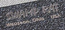
Why did SRKW discontinue this logo?:confused:

The open lettered version like the one on my Battle Rat is cool as well.

attachment.php


Did the new logo come about with the release of the Little Mischief handle design? It's nice, but as some have stated before, isn't as striking and to be honest is a little bit confusing as to what the logo actually represents especially when engraved on smaller blades. I would love to see them go back to one of the old school versions, paricularly the INFIcoot style. Who's with me?

By the way,I blame RATSKERSON
 

Attachments

  • rat_logo 1.jpg
    rat_logo 1.jpg
    17.5 KB · Views: 278
  • rat_logo 2.jpg
    rat_logo 2.jpg
    18.4 KB · Views: 275
Yeah. I don't know how that happened. I guess the mods should close one of them. I love it when computers have a mind of their own.
 
Mike,

I agree.... I have mentioned my thoughts on this before.

I prefer both of the above logos over the new one.

And I don't care for the Snaggle-tooth Rat or the Circle around the logo.
 
We change up our logo's from time to time. We still may do some things with the first logo, I do like it. It is simple yet effective.

BTW, I locked your other thread to consolidate discussion

:D:D
 
Thanks for locking that double post Eric. Sorry about that. Anyway, glad to hear that the 'ol-style logo may make a comeback someday. It's a sweet one. And the blades it is etched on are even sweeter. Rats Rule!
 
I love the Gold font on the INFIcoot! I've got so may blades in EDC rotation that the 'coot doesn't get out as much as he used to.
 
Thanks for locking that double post Eric. Sorry about that. Anyway, glad to hear that the 'ol-style logo may make a comeback someday. It's a sweet one. And the blades it is etched on are even sweeter. Rats Rule!


I also think it would look cool on a Shirt or a Hat. I'm also considering some "sterile" shirts ;)

:D:D
 
The little picture of a Bowie that Emerson used on his early knives and then dropped because he did not make bowies would work perfect for any of the Busse kin and I would bet Ernie would sell it cheap.
 
I also think it would look cool on a Shirt or a Hat. I'm also considering some "sterile" shirts ;)

:D:D


What is a "sterile" shirt???... :confused:


..... sounds like a white blank plain t-shirt?

How about a white or gray shirt with the Old original Swamp Logo??? Just simple.
 
What is a "sterile" shirt???... :confused:


..... sounds like a white blank plain t-shirt?

How about a white or gray shirt with the Old original Swamp Logo??? Just simple.

I always liked black on black... I have a daily uniform of black dickies and a plain black undershirt - and having black text wouldn't disrupt that :D

I have a really nice "Busse Custom Shop" hat I had embroidered in black on black...
 
I also think it would look cool on a Shirt or a Hat. I'm also considering some "sterile" shirts ;)

:D:D


OH YEAH! It's definitely time to start bringin' the shirts and hats. The INFIcoot logo will be tough to beat. Put that in the pipeline, Bully.
 
These exact colors as shown on the Inficoot would actually be a cool shirt (or hat !):

Tan shirt with goldish/tan letters (satin brighter outline / slightly darker inner letter coloring as shown) :thumbup:

attachment.php


Another option for those who like black shirts might be to have the satin gold letter outline, but black inside the letters.

?????? just some ideas....
 
I was thinking black or OD green Ts/hats with the SR logo in silver. The logo on the INFIcoot isn't really gold (at least mine isn't). It's silver as I guess it's just bare SR-101. The gold hue is an artifact caused by the camera flash.
 
Back
Top