Hand Engraver to the Rescue!

Joined
Oct 25, 2013
Messages
47
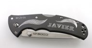
A nice young man called me to ask if there was anyway that I might be able to help him out of a jam a week before his wedding day! He purchased a couple of very nice Aluminum handled Code 4 folding knives for his best man and himself. Unfortunately the machine engraving he tried to have done (see picture) did not work out very well. I was able to create a design that covered over the machine engraving and still give him a pretty cool design. I also hand engraved another knife with the same design for his best man so they had a matching pair! It was nice to be able to help him out. He was quite pleased!

IMG_2174lightend.jpg

IMG_2160.jpg

IMG_2178lightened.jpg
 
Holy hell, that's awesome! Very nice work, man.

Just like a good cover-up tattoo, your design not only does away with the old engraving but enhances the aesthetics.
 
My critical eye, wants to tell you good job, while at the same time, give you pointers on proportional spacing letters.

The first three letters are on a different row, than the last three. Just a little off, but it makes the eye lock up on the change. This is maybe more important that the spacing between the letters. (which is still important)

The A & V are too far apart.

JAVIER

This is an example where a computer makes the same error. Different fonts, handle spacing between letters differently. As a sign maker, you learn what letters need crowding, and what needs more space.

IMG_2174lightend.jpg

Here is signage that works well with that name.

http://2.bp.blogspot.com/-yP4hLACrQ...AACCo/cU14ruIAGNQ/s1600/Javier_Hernandez7.jpg
 
My critical eye, wants to tell you good job, while at the same time, give you pointers on proportional spacing letters.

The first three letters are on a different row, than the last three. Just a little off, but it makes the eye lock up on the change. This is maybe more important that the spacing between the letters. (which is still important)

The A & V are too far apart.

JAVIER

This is an example where a computer makes the same error. Different fonts, handle spacing between letters differently. As a sign maker, you learn what letters need crowding, and what needs more space.

View attachment 452792

Here is signage that works well with that name.

http://2.bp.blogspot.com/-yP4hLACrQ...AACCo/cU14ruIAGNQ/s1600/Javier_Hernandez7.jpg

First off, that is some fine stuff, both the save and the new work.

I'm guessing you're a signmaker NRA. I do some rudimentary "signage" on my CNC machine at work so that's interesting to me. In the programming of the signage you just type in text at many points in the process. I've noticed what you say about the letter spacing. You're at the mercy of the fonts.

I have tried at times to convert things to vector and move things around. Seems like you never get it quite right. I've also noticed that most folks are so used to computer font spacing that they see no issues "as typed".

I dunno, interesting stuff, and I see the difference in your example.

You've gotta respect someone doing this stuff by hand though.
 
Thank you all for your compliments!

You are correct NRA that I could have probably pushed the A closer to the V. If you look at the bottom of the letters the V seems perfectly spaced between the A and I. Of course that makes the top of the letters seem farther apart. As for the first three letters being in a different row, perhaps the photo makes it look skewed but the entire name Javier is not in a straight row at all. It is slightly curved to better match the contour of the knife. I first tried a straight layout and it looked terrible. Not to make excuses but I will also mention that when hand engraving with a 120 degree V shaped graver there is another dimension to worry about as opposed to sign making. As the graver gets deeper the width of the line gets wider. When cutting through anodized aluminum it presents a challenge. The anodized finish is very hard and the 6061 aluminum underneath is much softer. Unlike a CNC machine which regulates depth, my only regulator is my feel and my eyes as I look through a microscope. So, I probably lean a bit more towards wider spacing in some places where I think that there could be a chance of two cuts running into each other which would ruin everything. But, that being said I truly appreciate constructive criticism as I am always striving to improve my skills.
 
Hello Bigmack - what kind of ka-bar do you have and where do you want the engraving on it? Seems like most ka-bar engraving is done by laser which I do not do. You can email me if you would like to discuss further or send me a pic of what you have in mind. david@dsengraver.com
 
Back
Top