-
The BladeForums.com 2024 Traditional Knife is ready to order! See this thread for details: https://www.bladeforums.com/threads/bladeforums-2024-traditional-knife.2003187/
Price is$300$250 ea (shipped within CONUS). If you live outside the US, I will contact you after your order for extra shipping charges.
Order here: https://www.bladeforums.com/help/2024-traditional/ - Order as many as you like, we have plenty.
You are using an out of date browser. It may not display this or other websites correctly.
You should upgrade or use an alternative browser.
You should upgrade or use an alternative browser.
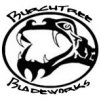
new logo?
- Thread starter Burchtree
- Start date
Gossman Knives
Edged Toolmaker
- Joined
- Apr 9, 2004
- Messages
- 9,402
I like it. Are you using it to mark your knives? If so, I think that would really look cool. You could also add some color for using on t-shirts. That's the way mine is (with color) I couldn't use it to mark my blades, to much detail. I think you've got a winner there. ")
Scott
Scott
- Joined
- Oct 9, 2002
- Messages
- 1,419
Pretty cool logo. I'd go with mete - the lettering needs to be clearer / simpler. I thought perhaps the snakehead thing could be flattened to make way for larger lettering. Jason.
blgoode
Knifemaker / Craftsman / Service Provider
- Joined
- Oct 3, 2003
- Messages
- 7,145
No a bad start......
Take a look at the perspective.
The mouth opening and the neck are on 2 different plains. I think it would be better to flatten the image so an etch would show up better. Also open up the text a little. Its a little hard to read.
Not a bad start but keep refining it....try getting tracing paper and us it to trace out a simpler line pattern....reduce the number of "swirls" and make each part of the dragon linart be very crucial. Simply put if you dont need the extra swirl....dont put it. Keep tracing and reducing untill you get what you like...
Thats my .02
- Joined
- Oct 3, 2002
- Messages
- 12,297
I like it ")
Don Hanson lll
Don Hanson lll
- Joined
- Nov 28, 1999
- Messages
- 14,985
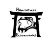
Burchtree said:Thanks for the feedback --- how about this little number:
How about the first version, only with everything simpler and bolder? That way, all the details will show easily.
- Joined
- Feb 6, 2001
- Messages
- 3,621
I'd have to agree with Mongo. I'd keep the blade logo simple. Folks aren't buying knives for the cool logo. If they like the knives, they'll know your name, logo-cool or not. If it's going on a t-shirt or hat...I'd buy one. 
- Joined
- Sep 14, 2002
- Messages
- 992
First let me say, I really like both of those logos, they're both extremely cool! I was having this same sort of conversation the other day with my knifemaking mentor, Ron Claiborne, and asked him about my logo...it's very simple, it just has my name and below it "Handcrafted Knives." His thoughts were that you should only have your name on there, and anything else is just distracting. To a point, I can kind of understand what he means. I may make up a new stencil and just start etching my name in the backspine for a while to see how I like that approach, that way it leaves the entire blade free and uncluttered. ...but your logos above are very cool, and if you don't use them on your knives, you should definitely make up t-shirts with them on it, I'd buy one to wear!
-Darren
-Darren
- Joined
- May 14, 2002
- Messages
- 117
Michael, the second one but lose the snake.
- Joined
- Apr 26, 2004
- Messages
- 207
i'm with mongo go with the t shirts and but me down for one
david
david
- Joined
- Apr 23, 2004
- Messages
- 22
How about the first one with a little dagger for the snake tounge?
Go with the T-shirt idea no matter what. You can make Good money with a cool logo by its self. The San Jose Sharks Hockey Team comes to mind as an example.
Go with the T-shirt idea no matter what. You can make Good money with a cool logo by its self. The San Jose Sharks Hockey Team comes to mind as an example.