-
The BladeForums.com 2024 Traditional Knife is ready to order! See this thread for details: https://www.bladeforums.com/threads/bladeforums-2024-traditional-knife.2003187/
Price is$300$250 ea (shipped within CONUS). If you live outside the US, I will contact you after your order for extra shipping charges.
Order here: https://www.bladeforums.com/help/2024-traditional/ - Order as many as you like, we have plenty.
You are using an out of date browser. It may not display this or other websites correctly.
You should upgrade or use an alternative browser.
You should upgrade or use an alternative browser.
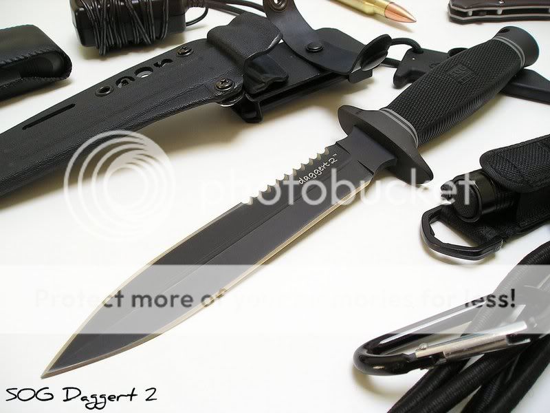
New photo of my Daggert 2
- Thread starter johnu2
- Start date

- Joined
- Jul 24, 2007
- Messages
- 3,285
What's the difference.
- Joined
- Mar 6, 2008
- Messages
- 3,200
It shows better contrast between the different colors of the knife, the angle is better, and the image is sharper and larger. (am I right? just a guess)
- Joined
- Mar 26, 2007
- Messages
- 1,925
I like both pictures... the bigger one is really sweet! :thumbup:
Thanks everyone!
Yeah knivesandguns is correct, plus I added a few more props and spread them out a little so it didn't feel as cramped and used a white background. I've been taking a lot of pictures of my knives lately so I wondering how I was doing. If I ask my friends, they start talking about the knife instead of commenting on the photo :grumpy:
Yeah knivesandguns is correct, plus I added a few more props and spread them out a little so it didn't feel as cramped and used a white background. I've been taking a lot of pictures of my knives lately so I wondering how I was doing. If I ask my friends, they start talking about the knife instead of commenting on the photo :grumpy:
- Joined
- Aug 7, 2007
- Messages
- 2,588
Yup yup, insanely cheesy. I'll take it off you to avoid the grief ")
Nice pic man, shweet looking knife. Quality pic like some pics in the net. How do you like it? By the way, can you let me know 1) how much was it, 2) how thick is it, 3) how long is it? and lastly 4) what steel is it?
PS: How does it handle?
Nice pic man, shweet looking knife. Quality pic like some pics in the net. How do you like it? By the way, can you let me know 1) how much was it, 2) how thick is it, 3) how long is it? and lastly 4) what steel is it?
PS: How does it handle?
I didn't realise so many people thought it looked cheesy with the words on the blade. I actually thought it looked more modernised with the lower casing.
I love it It was $93 not including shipping. The blade length is 6.6", total length 11.85", steel is AUS8. I can take pics of it compared with a Seal 2000, Sealpup Elite or Pentagon if you have any those. That way, you can get an idea of the size, thickness etc
It handles pretty well, weighted well. Feels quite secure in the hands with the kraton grip.
I love it
It was $93 not including shipping. The blade length is 6.6", total length 11.85", steel is AUS8. I can take pics of it compared with a Seal 2000, Sealpup Elite or Pentagon if you have any those. That way, you can get an idea of the size, thickness etcIt handles pretty well, weighted well. Feels quite secure in the hands with the kraton grip.