Noticeable HOG Badger Differences

BadAss182MK

Gold Member
Basic Member
Joined
Nov 21, 2017
Messages
116
Howdy! I got my Satin Hog Badgers with Black G10 today and I absolutely love them. They are amazing blades and are quickly climbing the charts on my favorite Busse Knife list. I love everything about them...the size, the scales and the balance.
I just wanted to share something with you all.

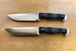
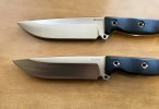
Upon comparing both of my HOG Badgers I noticed that they are both uniquely different even though they are both Satin with Black G10.

One has a solid-bold Busse logo while the other has kind of a ghost-like Busse logo and the differences don’t stop there.

The one with the ghost-like logo is slightly longer in length in both the blade and the handle. It also has a slightly uneven grind with a slightly different balance than the other HOG Badger.

The one with the solid logo is noticeably more polished with rounder edges with an extremely even grind. It is also much sharper than the ghost logo one.

I don’t mind these differences at all. I plan to keep both of them and it is actually beneficial to me so that I can tell them both apart. I just hope that the slight differences in length don’t cause problems in the future as I love to use Kydex sheaths. This is great proof at how handmade these blades are and how the hand fit and finish can vary from blade to blade.
 

Attachments

  • 0579AB94-4E1B-4315-8784-5373BF6E602C.jpeg
    0579AB94-4E1B-4315-8784-5373BF6E602C.jpeg
    213.5 KB · Views: 164
  • B3A98A66-7D3A-42AB-8968-434C3C214D9F.jpeg
    B3A98A66-7D3A-42AB-8968-434C3C214D9F.jpeg
    196.3 KB · Views: 157
  • DDCBDC75-70C6-4362-9BDB-8EF61EECF82A.jpeg
    DDCBDC75-70C6-4362-9BDB-8EF61EECF82A.jpeg
    222.2 KB · Views: 156
Pics look great.nice comparison.
If you want the logo darkened up. Or satin finish redone. Just email the shop. I’m sure they are going a 100 mph over there and an oversite will happen. Everyone knows this is not the norm. Busse isn’t happy unless we are happy. Give em amy a call Tomorrow.

Edit... the handle length difference has me boggled. Is one handle taller or wider than the other knife ? Or is it just the length?
 
I love the look of this new scale texture, or lack of texture. Really makes the micarta grain look beautiful. Nice knives.
 
Pics look great.nice comparison.
If you want the logo darkened up. Or satin finish redone. Just email the shop. I’m sure they are going a 100 mph over there and an oversite will happen. Everyone knows this is not the norm. Busse isn’t happy unless we are happy. Give em amy a call Tomorrow.

Edit... the handle length difference has me boggled. Is one handle taller or wider than the other knife ? Or is it just the length?

I love both of them, differences included. I know Busse would make it right if I wanted it but I honestly don’t mind the differences. The one with the ghost logo is going to be my EDC user and abuser. The other one will be a safe queen...I like these knives that much.

When I line them both up even with the talon hole near the choil it is noticeable that the blade and handle are both a tad longer on the ghost logo blade. Other than that they are both dead even when it comes to height and width.

These slim scales and texture are easily my favorite of all time.
 
Are the three tube holes lined up ? Or is the difference in front or behind them?
Good luck with the blades. They look really awesome. This will be a very sought after blade in years to come. Simple yet sexy!! :cool::cool::thumbsup:
 
I’ve definitely seen blade length variance before and grind differences. Blade length one I recall was in an order of Boss streets one was short by almost 1/4”. And for grinds I’ve seen variations like on the BG ASH some saber grinds ran much higher up. All said like op mentioned a lot of personal hand work goes into these. Each little difference adding to personalize these knives , so to speak. As long as mine don’t come short spine to edge or having a slight recurve, to things that for whatever reason drive me batty lol :-) I’m good.
Great knives :-) thanks for the pics :-)
 
Are the three tube holes lined up ? Or is the difference in front or behind them?
Good luck with the blades. They look really awesome. This will be a very sought after blade in years to come. Simple yet sexy!! :cool::cool::thumbsup:
Yes, the tubes line up. The pommel on the ghost logo one just comes down a tad longer than the solid logo one. I agree with you, these are destined to be a classic.
 
We saw those ghost logos on some of the A2 Team Geminis a few months back when Busse's YAG laser blew a valve and they had to use the fiber optic laser while they were waiting for the part from England. In the FMV8 thread, Jerry said production was delayed because they were waiting for a valve they could only get from England.

I think that might explain one of those differences.
 
Is it just an optical illusion or does the cutting edge sit a little further below the finger guard on one of them?

No, they are pretty even in that aspect. I think that’s more of an optical illusion from the pic.
 
My guess from years of No experience is the bottom blade is longer by the same length as the difference from the “E” in Busse to to edge of G10 slab.
Did I mention these are some really hot looking slabs of satin INFI. Looks like it will be a sweet thrower too.
 
Back
Top