(this is all personal opinion... what you like in photography is probably different then what i like, im just saying the points that i see that dont conform to what ive learned to be "good" photography, both from books and personal study)
not sure if you meant thumbs up/down to the photography or the knives, so i gave it a thumbs down for the photography.
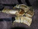
the basic reason being composition. the best example is the last photo in the first post. the knife is above the upper 3rds line, creating a lot of empty space at the bottom of the image. since the knife is the focus of the picture, the empty space, not having anything that is drawing your vision to the knife, is distracting. the grain of the fabrick all points towards the left hand center of the image, on the left vertical 3rds line, wich i think would have been a better position for the knife. as it is, you eyes are drawn left to the center, where there isnt anything but fabric.
esentially, when you take a photography, you should look at it and without having to think, in any way shape or form, be able to automatically know what the focus of the image is. obviously you know its a knife when you look at it, but the composition doesnt tell you that. it shows that the knife and the fabric are the focus, but neither of them are especially highlighted, creating a flat image.
any image, be it of a rock, concrete, a plant, an animal, a knife, or the clouds, should have depth, movement, focus, and emotion to it. if it doesnt have these things, it ends up looking flat.
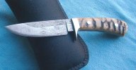
http://www.fototime.com/D2F2F1C07580DF8/standard.jpg
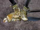
is probably the best photo of them all, not because it uses a unique angle or anything, but just because of the economy of the composition, very little is wasted.
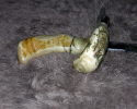
the knife conforms with the 3rds lines, though the sheath shifts the bulk of the focus to the upper part of the image, wich is distracting. and though there is a lot of empty space near the bottom, the grain of the backing fabric is in a circle spreading outward, and darkens at the corners, creating a natural frame moving your vision to the center of the photo where the knife is, allowing for some uneveness in the rest of the photo.
the photo of the hatchet is excellent. while there may be a little room for improvement in lighting, to highlight the grind of the head etc, it is well composed, well lit, and overall a very pleasing image.
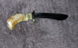
if you meant the knives, ive never been a big fan of the pronghorn style... even though its a very ergonomic style, its always looked really uneven to me. the execution is bueatiful though
 Overall, I like it.