Spyderco logo on box looks different.

Joined
Sep 6, 2020
Messages
23
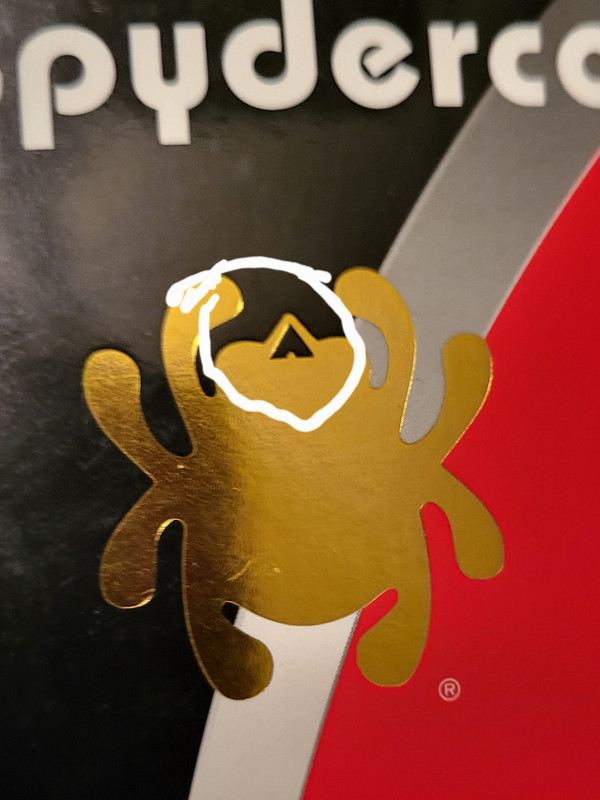
I just received a new spyderco and I noticed the spider logo on the box is slightly different. When I googled how to spot a fake I saw post and vids claiming you can spot a fake box by the opening on the spider logo's fangs. Basically the triangular opening Is supposedly larger on fake boxes, Is this true?

Here's the logo
Nativez.jpg


Supposedly(because I don't know if it's true or not) This is what the real logo is supposed to look like:
Manix2circ.jpg

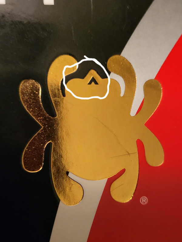
See how it's smaller, Is there any truth to this? Also can legit spyderco boxes look different?
 
Fake Spyderco boxes are pretty easy to pick out based on color and design but the one thing that fakers can't fake (or at least, I haven't seen any yet) is the model/bar code label at the end of the box.

I would be suspicious of any Spyderco knife offered for sale or sold without a label and w/o a date code and bar code that corresponds to the knife being sold/purchased.

PS: Even if the box is legit, the knife could be a fake but I've never experienced this problem myself.
 
Last edited:
The packaging differences could be as simple as two different suppliers printing/stamping the boxes differently. Just get your knives from reputable dealers and you won’t have anything to worry about.
I bought them both from authorized dealers. I was just checking it out after I saw this vid
about how to spot fake pm2's. Also saw this site saying something similar. https://knifegeeky.com/how-to-spot-fake-spyderco/
Now I'm wondering if it's like an urban legend lol.
 
I was just being a smartass because I can't resist ;) , I hope I didn't derail any convo about the box printing.

In all seriousness, I think I recall hearing that Sal said he didn't want a menacing spider when he designed the logo, so they came up with the little bug guy. Probably a good move because it would be hard to make a mean looking spider logo not look corny and it would likely come across as flea-market-knife-ish.
But that doesn't explain why they decided to use a tick for the logo.
 
Back
Top