-
The BladeForums.com 2024 Traditional Knife is available! Price is $250 ea (shipped within CONUS).
Order here: https://www.bladeforums.com/help/2024-traditional/
You are using an out of date browser. It may not display this or other websites correctly.
You should upgrade or use an alternative browser.
You should upgrade or use an alternative browser.
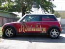
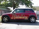
Car ART Review.
- Thread starter JTknives
- Start date

- Joined
- Jan 18, 2007
- Messages
- 1,976
I Like It.
- Joined
- Aug 13, 2002
- Messages
- 5,703
JT, I like the white better. I know you don't have that much space to work with but I would like to see either the text higher or maybe some kind of wavy text to catch the eye more.
Don't know if this makes sense.
Patrice
Don't know if this makes sense.
Patrice
Stacy E. Apelt - Bladesmith
ilmarinen - MODERATOR
Moderator
Knifemaker / Craftsman / Service Provider
- Joined
- Aug 20, 2004
- Messages
- 38,513
I like both. The colored one is less harsh, but both are quickly readable. I prefer the colored one. The .com is clear enough now to see the connection to the name. I would add the "Hand Made Knives" over the wheel, though.That should be all you need to catch the attention of a potential customer. Your web address is not case sensitive, so there is no need to worry about anything more than the name sticking in the potential customers head.
Stacy
Stacy
- Joined
- Feb 28, 2006
- Messages
- 3,494
+1 with Stacy.
The JT actually seem more readable to me with the colored one. I also think you should put the Hand Made Knives back over the wheel, but maybe just in white (this time I think I'm with Patrice.)
I forget, is this going to be painted on, or something like magnetic vinyl, or something else?
Will you have brochures and/or business cards in the car to give to folks when they ask about it? Might should. Are you using something like your tattoo for your logo (not on the car, but on your printed material)?
- Joined
- Jan 10, 2007
- Messages
- 1,924
I like it as well. If I were to pick I would go with the white one. However, I think that both are nice.
- Joined
- Dec 10, 1998
- Messages
- 4,860
Have you considered the safety and security aspects of advertising on your car? Your car would be easliy identifiable, especially to the police. It might allow people to follow you to your home or to work and maybe want to burglarize you? It may also attract a clientele that wants to buy cheap crap and not customs.
It would be like advertising Jewelry on your car. Most people might think that you were carrying jewelry or there might be some samples inside.
I don't even have my home address on my business cards, I don't want the public to know where my shop is.
It would be like advertising Jewelry on your car. Most people might think that you were carrying jewelry or there might be some samples inside.
I don't even have my home address on my business cards, I don't want the public to know where my shop is.
- Joined
- Jan 13, 2006
- Messages
- 1,655
+1 with Stacy,
That colored one looks like an old west sign. I really like it.
That colored one looks like an old west sign. I really like it.

- Joined
- May 18, 2005
- Messages
- 23,130
It looks a little stretched out vertically.
- Joined
- Apr 14, 2009
- Messages
- 159
For what its worth, I like the first white one better. just my 2cents.
CDHumiston
Gold Member
- Joined
- Feb 17, 2009
- Messages
- 1,464
I like the last one best, the colors in the letters look better than plain white to me.
Ebbtide
Gold Member
- Joined
- Aug 20, 1999
- Messages
- 8,022
Go half and half.
Try making the JT the same colors as the "hand made knives" in the last photo.
This would give the design some rhythm as well as separating JT from Custom Knives.
As you have it there it tends to run together.
Or put the JT in a graphic device like an ornate oval, maybe with the tips of the letters breaking out just a bit.
Move the .com to the left aligning it with the s in Knives.
Everything lines up with something else.
")
Good design will keep the elements separate, easy to read and easy to recognize, even as a whole.
You are very close, just need to tickle it a little
Try making the JT the same colors as the "hand made knives" in the last photo.
This would give the design some rhythm as well as separating JT from Custom Knives.
As you have it there it tends to run together.
Or put the JT in a graphic device like an ornate oval, maybe with the tips of the letters breaking out just a bit.
Move the .com to the left aligning it with the s in Knives.
Everything lines up with something else.
Good design will keep the elements separate, easy to read and easy to recognize, even as a whole.
You are very close, just need to tickle it a little
- Joined
- Jul 4, 2009
- Messages
- 1,201
I took the liberty to come up with a design and PM'd JT.
Hope he doesn't mind me posting the result here, I figure if he can handle a little public scrutiny for his mockups, then so can I.

Hope he doesn't mind me posting the result here, I figure if he can handle a little public scrutiny for his mockups, then so can I.
- Joined
- May 18, 2005
- Messages
- 23,130
You might need (or want) to limit it to the door only, depending on materials used for the graphics.
Stacy E. Apelt - Bladesmith
ilmarinen - MODERATOR
Moderator
Knifemaker / Craftsman / Service Provider
- Joined
- Aug 20, 2004
- Messages
- 38,513
I really like Los Angeles' idea. It is concise and readable.
Only change I would make is to add the word "knives" to "American .Hand Made", so it says " American. Hand Made Knives".
Stacy
Only change I would make is to add the word "knives" to "American .Hand Made", so it says " American. Hand Made Knives".
Stacy