Need advice for improving my makers mark

Joined
Nov 27, 2013
Messages
1,626
As it is now, it just seems kind of blah. As it sits now I have it loosely patterned after Loveless' style makers mark.

I'm looking into other fonts but haven't figured anything out yet.

Anyone have any advice on how I can improve it? I'd greatly appreciate it.

View attachment gordon.pdf
 
Maybe if you were to show us your mark, there might be some more suggestions. It looks like you posted something TUS might have sent you as an example. Keep the font simple and easy to read. A small, clean logo or emblem in the center (instead of maker) is a nice touch.

Bob

Untitled by Bob, on Flickr

Actually that is my purposed makers mark on that PDF. It's the bottom three marks. The top two are what they're patterned after.

I like the idea of putting a logo in the middle. Thanks for the idea. Your mark looks real good btw
 
Well for a start

The Loveless - Johnston logo

middle says "marker" not "maker"


I like "Handmade"
It's more clear to people
 
I'm in the "keep it simple" camp so I like the direction you're heading. You could consider playing with different font styles to dress it up a bit IMO.
 
My apologies, I didn't even notice your mark, just looked at the top one. I know a lot of makers like to put "Handmade" on their mark but I'm not in that camp. That's like putting "hand painted" on a oil painting. If it has your name on it and you make handmade knives, it's a given. Now if you start making production knives down the road, you should have some way of distinguishing. I am big on the branding/marketing aspect; that is why my mark looks the way it does. It is traditional AND it speaks to the brand. It's not something you come up with overnight. I have hundreds of hours in my branding/marketing strategy and it is all pretty basic as far as that kind of stuff goes.

If not a logo in the middle, you might also consider a catch phrase or some meaningful Latin phrase (Summa Qualitas). The mark needs to be simple and memorable.

Bob
 
I agree with what Bob is saying here. Have a "brand" not just a "name". In fact our logos are fairly similar in that the name is there, a logo is there and the logo quietly implies quality and craftsmanship. Though Bob likely trumps me with his Ranger tab ;)

I don't have a photobucket account so I can't post it but if you think it might help I'll send it over if you shoot me an email.

I think next generations custom knife buyers are starting to change the game up!

-Clint
 
Whatever you choose to do about using a brand logo or simply text . . . you'll have better etching success with large bold font and few thin-lined details. The etch/logo will be more pronounced and distinguishable.

Try using only your name and location in bold font without artistic (curved) text. In the long term, it may be the best and simplest way to identify yourself.
 
Gosh, now I have a whole bunch to think about lol. I really appreciate the input gentleman. As it stands now I don't have a mark at all. I might try and get them to make the current mark a little bolder and just get a run of those to get me by until I come up with something more elaborate.

I was throwing around the idea of possibly adding a simple/small compass logo in the middle but haven't found anything yet.

Thanks again gents! I'll keep you posted.
 
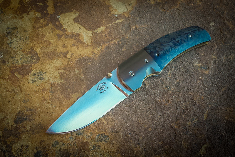
Yep, the more complicated the logo, the worse it looks, in my opinion. Simple, clean, and sized proportionately to the piece it's on. I really like how Rick Marchand of Wilder Tools designed his. Best of both worlds, I'd say.

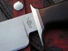
Personally, I will not buy a knife that has a business card printed on the side. I don't need to know what city and state you live in. And if you put "blade smith" or "knife maker" on it, I will chuckle as I walk away.

Your name and your "logo" are more than sufficient to identify your work. If I saw one of your pieces on the second-hand market, it wouldn't be terribly difficult to find out more about you and your work with a little internet surfing. The key thing, though, is building the universe around your products. A lot of makers ignore the internet, or only put up a token website, and don't think about how it all works together to create something larger than the sum of the parts.

Take your time. Think on the motivation that drives your interest. Think about how your maker's mark will look on a website. All the little details matter. Castles are built with tiny little stones, and the quality of each stone determines how good the castle will be.
 
Okay, so I updated my mark a little bit and put a compass in the middle of my name and city/state instead of "handmade." What do you guys think?


It kind of seems like my name could be lowered a tiny bit. I asked them to do it. So we'll see how that looks. I kind of like it though.
 
Unless you're locked into TUS you may want to consult with Patricia at IMG. She tirelessly worked with me for over a week sending samples of what I thought I wanted and then her suggestions of what she thought would work better. She was very patient as well as very knowledgeable and their product was top notch.
 
Unless you're locked into TUS you may want to consult with Patricia at IMG. She tirelessly worked with me for over a week sending samples of what I thought I wanted and then her suggestions of what she thought would work better. She was very patient as well as very knowledgeable and their product was top notch.

Dang, that bad huh? LOL. I'm gonna keep working on my mark, but for now, I just need something to put on my knives. I'm liking the newer mark but it kind of seems like the compass might be off-center a little. Then again, there's a good chance I'm mistaken... I figured I'd see what you guys thought of it.
 
I think you're on the right track! Is the compass going to be part of your branding? I think the branding/marketing side is the hardest part to do right. Do you have a facebook or web page? I would like to take a look to see if I can offer any suggestions.

Bob
 
Why is a compass part of our logo?

Kinda reminds me of the eye of sauron :)
 
I choose the compass because I'm trying to focus on utilitarian/outdoors tools. Also, I thought it would portray my knives as being an fundamental tool, like the compass. The compass is a tool that will lead you in the right direction and my goal is for my knives to do the same(in a figurative sense).

No facebook or website but that will be happening very soon.

Thanks for the input gentlemen, I really appreciate it.
 
Don't put the compass on the mark until you've gotten the entire "story" worked out.

While I'm a big fan of the compass rose as a decoration, it is a little bit over-done by folks. There are a eleventy billion different things you could do for a logo, but the important thing is having the tale woven so that everything fits together. The universe that the knives are a part of, the story, is what attracts the buyers. For whatever reason, folks are interested in being a part of the tale and not necessarily the actual product being sold.

I'd strongly recommend you take a look at Wilder Tools or Cedarlore Forge for cues to how one might develop the whole package.

Don't be in a hurry or think you absolutely have to get something out there. If you use just your name, you can always add to it later.
 
I choose the compass because I'm trying to focus on utilitarian/outdoors tools. Also, I thought it would portray my knives as being an fundamental tool, like the compass. The compass is a tool that will lead you in the right direction and my goal is for my knives to do the same(in a figurative sense).

I like the compass dude… it makes sense given the branding goals you noted above.

I think the logo looks good as is… but if I was trying to finesse it, I might tweak the shape/location of the text to avoid the "eye" look (which I didn't see until the other mentioned it). Or maybe increase the size of the compass slightly so it looks less like a pupil; and maybe on top and bottom, the points could extend between James/Gordon and Topeka/Kansas.
Just brainstorming... but as mentioned, I'd also be OK with the design as it is.

Erin
 
Last edited:
i liked the original logo you posted :) but i am partial to the loveless logo, i adopted some of it as well. but as logem had mentioned, if you are etching those fine compass lines may not all come out as crisp. personally, i think the compass is overpowering the mark, it seems very large. i think the focus should be on the makers info. i agree the mark should not be a business card, but i like to know the name and location of the maker. i see knives with just a symbol or design mark, no name. it is hard to google a symbol. i am not worried about now, i am more concerned that people know who made my knife when i am gone. here is my loveless influenced mark.
 

Attachments

  • DSCN9339.jpg
    DSCN9339.jpg
    55.8 KB · Views: 15
Last edited:
Back
Top