Perspective pictures... tick anyone else off??

Joined
Oct 4, 1998
Messages
529
Why do so many manufacturers use pictures of their knives "in perspective" as promo shots? Busse and Camillus/Becker are very bad about this. Don't get me wrong, I love both Busse and Becker knives but when I want to see pictures the first thing I look at on a knife is the profile of the blade. In a perspective picture the profile is undiscernible. I am tired of seeing the point way in the foreground with the handle tapering off as it fades into the distance or vice-versa. I know it's probably an "artsy" thing, but come on guys, you're selling knives, not shooting a layout for Penthouse. I hate it when a new knife is announced and I can't even tell what the blade profile looks like because the photographer wants to make "art".

Just ranting...
Cam
 
Yeah I know what your saying, I would rather just see the knife flat down on a colored background.
 
It isn't a terrible bother to me, but I would prefer if shots without hyperperspective were also included, so that I could get a better idea of the actual proportions of the knife.

On a related subject, I've wondered why--if that is what blademakers want their knives to look like--they don't actually make them that way. Conversely, if they don't think that is the best proportionality for a knife, why do they want to make it look like that in pictures?
 
Cold Steel is very good about their pictures..The knives are flat against a background so you can see it.
 
They don't realy tic me off so much but like you I want to see the side profile without any angle shot. This gives me a much better idea about the blade's profile than having to imagine it from a perspective shot. That is why all the ads I do I do myself. I don't want some artsy fartsy ad guru telling me how to do my ads when I know that people just want to see the knife.

An ad has to follow the 5WH rule (Yes I made up this rule :) ).
Who - Who makes it?
What - What is it and What does it have?
Where - Where can I get it?
Why - Why should I buy it?
When - When will it be available?
How - How do I buy it?

If it has the above it is an OK ad. The rest is just fluff and distractions. My ads are simple and "To The Point"
My photography is clean and I do not use perspective unless I feel it is necessary, like my map shot with the Tachyon.
Sorry Joel just my .02
 
Orion and gang,
I appreciate the feedback. I work on the ads for CAMILLUS/BK&T, and will keep your comments in mind for the future. We make sure that all of the BK&T ads have the main picture as a full-flat shot, to show the deminsions and configuration of the knife. We then have been using smaller, perspective pics around the edges of the ad to so features of the knife, like swedge, pommels, sheaths, etc. Understand, that with knives as large as BK&T's, its difficult to show the whole knife in a 1/3 page ad, and ads ARE EXPENSIVE:rolleyes:

I can't remeber any BK&T ads that didn't have the main pic in the ad as a "full flat" pic, so are you guys saying that you don't won't any other smaller pics around the borders if the aren't on a 90 degree perspective?

I'm just trying to get a "perspective";)

Thanks for the input:)
 
Funny, I don't think I really have problems with the Becker/Busse shots of their knives.... it ain't that bad.
I actually have problem with Spydercos (gasp!) in that I actually have nothing to compare to, so I might start thinking the Chinook a 3" folder and a ladybug a 2" folder.
Anyone else have that problem?
I know the specs are there, but still pictures speaks a thousand words.
 
Mike-

You do a very nice job with your pics. Keep up the good work.

Will-

Your magazine ads are very good overall, also. The pictures I was mostly referring to are single pics that are posted on the web, usually here on the forums. There are sometimes rifles and pistols and pistol magazines added and that just takes away from the knife, IMHO...

The best picture, as mentioned, is a flat pic of the knife on a neutral background. That way we can all see the actual dimensions of the knife. An ad that has other pics is not bad at all as long as it does contain a flat/neutral pic also.

The thing that got me perturbed about it last night was going through the Busse forum... The post would say "PICS!!!!" and then they would have about 7 different pictures of some variant that I have never seen before... EVERY picture was a perspective picture so I still have no idea what these knives actually look like...

Peace-
Cam
 
When you have your portrait taken by a professional photographer, you expect a different result than when the DMV takes your driver's license picture. The DMV actually has specific rules about how your driver's license picture must be taken. Driver's license pictures are for technical purposes, for identification. Most people have a professional portrait taken for some other reason. For those other reasons, professional publicity, weddings, graduations, family keepsake, etc., we generally want a picture that's more flattering, more interesting, with a specific theme or message, maybe even one that hides our little flaws while emphasizing what we see as our stengths. The DMV wants a picture that clearly identifies the subject. We generally want a portrait that makes us look attractive or interesting or professional, whatever.

Next time your at the Post Office standing in line while the person in front of you mails 35 packages each of which has to be weighed, look over at the wall where the wanted posters are. You'll probably see someone you know. Well, probably not. But, you'll probably see someone who looks a lot like someone you know. Despite the fact that we all strive for individuality, style our hair, grow a beard, new glasses, whatever, when you strip it all back to a very technical mug shot, what you basically discover is that people look a lot alike. There's only about four or five basic face shapes. Just about everyone's got two eyes, a nose, a mouth. The basic features are the same

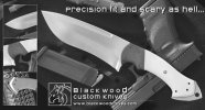
The knife photographer finds the same thing is true. After a while, knives all start to look the same in thos those technical, what I call "knife mug shot", pictures. So, you start to search for ways to make the picture more interesting.

Portrait photographers often have their subject turn and take the picture at some angle. My avatar is done that way. It makes it more interesting than a flat, straight-on head-shot. It makes it look like less of a mug shot.

The three-dimensional picture is exciting. It's attention-getting. It makes your product stand out. And that's why many manufacturer's prefer them for advertising.
 
As a web/graphic designer, i often take photos in at a particular angle or request that they be taken at a particular angle because i want Impact. In an ad, the knives that are often shown in profile do not create impact and you may not even notice them. It may bother people that they don't know what the profile of the knife looks like, but often that is what draws your eyes to the ad.
 
Critique, Criticize, tell me what you think??


Neil
 

Attachments

  • smallbwad.jpg
    smallbwad.jpg
    34.2 KB · Views: 448
OK Doc, you asked, Insert shots that are the same size or smaller and taken from the main subject are a waste of time and space.
 
Originally posted by Mike Turber
...An ad has to follow the 5WH rule (Yes I made up this rule :) ).
Who - Who makes it?
What - What is it and What does it have?
Where - Where can I get it?
Why - Why should I buy it?
When - When will it be available?
How - How do I buy it?
...

Reminds me of the quote from Rudyard Kipling;

<center>I keep six honest serving men
(They taught me all I knew).
Their names are What and Why and When
And How and Where and Who.
</center>

Good plan!
G2
 
I think it totally rocks Neil !!

But what would really liven that ad up is if someone were holding it in their hand , so that people would know how it looks in the hand.
It's kind of hard to explain , just send it to me and I will take the picture so you can see what I am talking about. :D

Just keep on keeping on sir ! :D
 
Neil, I agree with Phil. If you are going to use inserted pictures they should show parts of the knife not seen in the main picture. Possibly showing the knife from different angles.

I to like to get a good look at a knife from the perspective that will give me the best idea of what the knife really looks like, but I really have no problem with the pictures in ads being done to add impact. That is what an ad should do. If I want to see a knife from the proper perspective I will go to the companies web site. It seems that the pictures you see there are always taken directly from the side.
 
When I viewed Neil's photo, I thought ...looks fine to me! Then when I viewed TheBadGuy's reworked photo, I gotta admit - I preferred it without the smaller photos! Just sort of 'grabbed' me more! Just my .25 worth!

(How come the computer keyboard doesn't have a 'cent' sign?):rolleyes:
 
Neil,

If you want my opinion (as a professional nature photographer): that ad is better than average looking, and has a lot of promise, but could still stand for a lot of improvement. I think the three little inset pictures add nothing. I would remove them, or replace them with pictures which do add something, such as a picture of the knife in someone's hand, which gives and idea of how the countours of the handle fit the hand.

The butt of the flashlight, or whatever that is, at the top, looks distracting, sloppy, and bad. There isn't enough of it to make it easily identified, just enough to draw your focus away from the main subject, as you wonder about it. I would also loosen up the composition just slightly, showing the tip of the gun handle and barrel (if you choose to keep the gun in the add), and would show the entire bullet clip, instead of cutting it off. Then I would retake the photograph with the light at a slightly lower angle, to emphasize the grain in the micarta (?) better, and to add a little texture to the nearly featureless monochrome background. I also think there needs to be a touch more room in the text, on the right side, after the ellipses marks.

The overall flow of the lines through the add is very nicely composed.

By the way, I love that knife. And while we're on the subject of my predilection for your knife designs, I haven't heard back from you about the Skirmish.
 
Originally posted by Clydetz
[B
(How come the computer keyboard doesn't have a 'cent' sign?):rolleyes: [/B]

You must have a cheap keyboard. Just my 2¢.

Bwahahahahaha
 
Back
Top