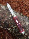
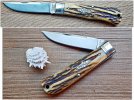
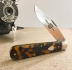
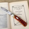
Upside down text bugs me but that's not the only reason the second photo is better. Top photo knife is straight and lies parallel with the horizon, second photo is full of angles. Straight lines are boring, angles are more interesting. Why have the text upside down unless you absolutely have to?
Chief is exactly right...it's all about the angles. Diagonals, triangles, repeating patterns, these all create interest. Lines leading from or disappearing into the corners create interest as well.
Composition is the key. Sometimes it looks better if the shield can be read, sometimes it doesn't matter at all.
The same with blade etches, although they seem to jump out at you more if they look "wrong" by being upside-down.
I probably take 15 or 20 photos for every final picture I keep. Play with the composition until you find something pleasing to the eye, shoot from all angles, and cull through the results ruthlessly. There are some excellent photographers here on BF, and I try to draw ideas and inspiration from them.
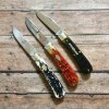
In this one, the banner on the Tidioute is upside-down, but it doesn't affect the photo at all.

Both blades and handles create interesting angles in the Talon pic.

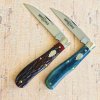
With the 15, the handle is more or less static, but the blade is angled and you can read the etch. The camera in the corner just adds filler for composition and is slightly blurred, as the knife is the focal point.

Diagonal knife fills the picture, the etch can be read, and the book runs off the lower left corner.

With the Big Jack, the log runs from corner to corner (almost) and extends off the picture, creating triangles with the pine straw underneath. Placing the knife at a slight angle just adds to the effect.
