-
The BladeForums.com 2024 Traditional Knife is available! Price is $250 ea (shipped within CONUS).
Order here: https://www.bladeforums.com/help/2024-traditional/
You are using an out of date browser. It may not display this or other websites correctly.
You should upgrade or use an alternative browser.
You should upgrade or use an alternative browser.
Phun with PhotoShop
- Thread starter PhilL
- Start date

- Joined
- Oct 1, 1999
- Messages
- 6,490
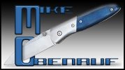
Sometimes I play with a new technique or do a tutorial just to see if I can do it. This one was just to put an image and type together, I think it's an interesting effect. I'm still not sure how good the overall illustration is? I'll let you be the judge.
Attachments
Ebbtide
Gold Member
- Joined
- Aug 20, 1999
- Messages
- 8,008
Since you asked ")
How about having the blade come into the "O" from behind?
This way the "O" will read less like a "C"...
I'm a real fussbudget about keeping the integrity of letters/characters.
Alot of times it is the negative space that defines a letter. Especially when you show only part of a letter or bend/twist/distort it.
A good exercise (with a pen) is to just roughly draw the negative shapes of a word. An "O" would be a dot, a "B" would be one dot over another, etc. It gets you thinking in another direction.
Other than my fussy nitpick, methinks it's cool")
How about having the blade come into the "O" from behind?
This way the "O" will read less like a "C"...
I'm a real fussbudget about keeping the integrity of letters/characters.
Alot of times it is the negative space that defines a letter. Especially when you show only part of a letter or bend/twist/distort it.
A good exercise (with a pen) is to just roughly draw the negative shapes of a word. An "O" would be a dot, a "B" would be one dot over another, etc. It gets you thinking in another direction.
Other than my fussy nitpick, methinks it's cool
- Joined
- Oct 1, 1999
- Messages
- 6,490
Wally, you hit the nail on the head, that's why I was wondering if this worked or not. As far as just the negative space on letters, I used to do a lot of that back in the late 60's, as well as just about everyone else that was desiging Pschodelic posters and graphics. 

- Joined
- Mar 3, 2000
- Messages
- 4,798
How about having the blade come into the "O" from behind?
Better use a "sheath" there, buddy.
Phil, ol' Jared at Subway got nothin' on you, man. Leave it to timmy to expose a guy. Anyhoo, that bowie pic is exceptionally cool. I agree with the thought about the hollow grind, but I think with the blade that size, the pic would lack a bunch of otherwise excellent detail.
Keep it up, Phil. I love lookin' at your stuff.

- Joined
- Oct 1, 1999
- Messages
- 6,490
This is not my work, it's what I aspire to.
WARNING: There is Nudity...It is ART...and there is Knife Content!
http://www.photoshopcafe.com/cafe/viewthread.php?tid=461
WARNING: There is Nudity...It is ART...and there is Knife Content!
http://www.photoshopcafe.com/cafe/viewthread.php?tid=461