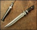
Trash or Cash? - The Final Verdict

Handle looks great but the recurve makes the blade appear like it was bent/damaged. I feel like straight handles look good with straighter blades and curvy handles to curvy blades. The ricaso/choil thing going on their is ugly.

Does the blade mid-line (not sure what's it called on double-edged knives) not follow the curve of the belly?

I almost want to say the knife would look really nice without the ricaso/choil thing mentioned above, I can't take my eyes off it and it ruins the experience for the rest of the knife, especially the handle which is quite sexy.

Ah yes - another trash vote
 
First of all very nice knife, second of all the issue at hand should be an easy fix, or at least I think so. I think reducing the frown a little on the front edge by carefully removing a smidgen of steel between the narrowest part of the front bevel and the ricasso to make the edge more parallel to the spine would be the first step then maybe removing another extremely small amount of steel between the narrowest part of the front bevel and the tip to even it out. Then second take a small amount off the back edge near the riccaso to even things out, there appears to be plenty of steel on the blade to do this, then it would be perfect like all the other knives you make TK.:D
 
OK, I'm the guy that can't talk without a pencil in his hand...
And...
If I may be so bold ;)

Not trash by any means. I think it just has one too many curves where you tried to make it symmetrical when it doesn't have to be.
Good design has a sort of rhythm (and you nail that 99% of the time).
So I had to mess with your photo :sheepishsmile:


I took out one choil and raised the blade in relation to the handle a bit.
Now there is some rhythm (to my eye at least) going around the knife.
The spine of the double grind is now in line with the center line of the handle.
That looking off my be a trick of the camera in your photo and could very well be lined up.

I always look to Walter Brend's sub-hilts as the stellar example of rhythm in knife design.

Please take this is in the good spirit intended.
:D

Thanks for the feedback - no offense taken at all. :)
 
First of all very nice knife, second of all the issue at hand should be an easy fix, or at least I think so. I think reducing the frown a little on the front edge by carefully removing a smidgen of steel between the narrowest part of the front bevel and the ricasso to make the edge more parallel to the spine would be the first step then maybe removing another extremely small amount of steel between the narrowest part of the front bevel and the tip to even it out. Then second take a small amount off the back edge near the riccaso to even things out, there appears to be plenty of steel on the blade to do this, then it would be perfect like all the other knives you make TK.:D

Scott - I'm confused - can you draw me a modified photo?
 
I agree, that upper choil thing doesn't work for me, from a looks perspective
 
TK! You know my mom said "if you can't say something nice, then..............." Well, if I was going to buy a knife from you. I'd pick one of your other ones.;)

Paul
 
My photo editing skills are terrible I know but here it goes, I rounded out the frown in the front bevel a little and evened fit a bit on the back bevel on the original pic. I couldn't make it a little bit narrower at the choil area like I wanted, but this I think could still work for this knife.Trash-or-Cash_zpsz6eot455.jpg
 
Definitely trash, send it to me and I'll make sure its disposed of properly. LOL Actually I like it, double choil and all but I like anything different if its done properly and this one is.
 
I'm not a fan of the recurve. Rather than giving it a "Persian" look, it looks to me like you accidentally took off too much material with the grinder.
 
I'm not a fan of the recurve. Rather than giving it a "Persian" look, it looks to me like you accidentally took off too much material with the grinder.

Another trash vote I see
 
My photo editing skills are terrible I know but here it goes, I rounded out the frown in the front bevel a little and evened fit a bit on the back bevel on the original pic. I couldn't make it a little bit narrower at the choil area like I wanted, but this I think could still work for this knife.View attachment 719276

Scott: I like what you did here :)
 
Hey, who doesn't love a good pile on? Of course it should read who doesn't want to pile on the love. I know you know we all love your work and want to help. If you don't mid yet another opinion....

I think for me some of the issues were spotted and pointed out in Scott Hanson's post. In your original photo you have a curve in the swedge and in the edge. But the "curves" were a bit abrupt and read more as kinks. The kink on the swedge was forward of the kink in the edge giving the blade a bent feel. At the same time the ridge of your bevel grind was pretty straight until it approaches the tip which feels incongruous with the top and bottom curves or kinks. In Scott's depiction those kinks have been softened which feels more organic and natural.

The double choil is an interesting feature but doesn't feel right to my eye. Firstly it breaks up the flow of the knife. You have a fairly linear design but it has a big dip right in the middle. Ok, I can see how you might want to hold the knife in a reverse grip position with a finger wrapped over the guard so, functionally it might make sense in that regard. However, in that reverse grip situation you would have the sub hilt digging into your palm. So that defeats the functionality reasoning for me.

As others have said, it is far from trash. Beauty is in the eye of the beholder. You just need to wait for the right eye to behold it. I think it is a bold move and worth the try. As a maker you have to try new ideas. Some will work, some will fall flat. I respect the effort. And as usual the workmanship is top notch.
 
Honestly...I like it, but for me it ticks that kinda impractical fantasy flare aesthetic that I like, but are often junk pieces. So I like this has a nice almost practical fantasy blade... I would buy it, but your work is outa my wallet's reach lol
 
Honestly...I like it, but for me it ticks that kinda impractical fantasy flare aesthetic that I like, but are often junk pieces. So I like this has a nice almost practical fantasy blade... I would buy it, but your work is outa my wallet's reach lol

Oh yea!! One for cash! Looks like the trash folks are winning:)
 
Make the blade wider with a more pronounced recurve, that flows better, and it would look great, even with the double ricasso. In my opinion, for whatever that's worth.
As is, it seems the blade handle ratio is off, and the lines do not flow well.

Respectfully,
Darcy:)


Some of you guys are gonna think I'm crazy but, there's nothing that goes out of my shop that I'm not proud of - even a gift. I appreciate all the respectful feedback - it was a hoot. Sometimes, designs don't work out as planned on paper! Back to the drawing board :)
 
TK don't play.
Shame to see the knife broken like that, but I totally understand why.
 
Back
Top