why so much writing on knife blades?

shootist16

knife law moderator
Moderator
Joined
Dec 25, 1998
Messages
7,394
I really think that all the writing that several manufacturers are putting on knife blades really takes away from the knife. I really like the Camillus EDC, and plan on getting a Talonite version, but have you seen how much writing there is on that blade?
 
One of the reasons I sold my MOD trident was because of all the writing they managed to pack on that little blade.

I prefer my blades with no writing at all....
 
You said a mouthfull Dennis!

Some knives today have so much stuff written on there I feel like I should be getting paid to advertise every time I open one up!

What ever happened to a simple logo or tang stamp?
 
The industry should really try to follow the example shown by Darrel Ralph ("DDR" engraved on clip) and Chris Reeve (CR logo engraved on handle)in terms of subtle marking. I too dislike writing of any type on the blade. It will eventually wear off with use and look like crap. Tang stamps are A-OK in my book as they will last forever and generally don't draw attention to themselves. Let the knife speak for itself I say.
 
Folks-- is there any way to get the darned lettering off the blades?? CRKT is great, but I'd like it if at least the letters were more-- subtle-- EE
 
My pet peeve is when the writing is childish such as macho names written all over the blade. A few years ago I bot a Paragon Corby/Cobra because at the time I thought it was one of the best looking production autos out (still do). But the thing that ruins the knife for me is the stupid large lettered "COBRA" on the blade. It would be one thing if I were still playing with GI Joe's.
Bob
 
Add me to the list of those who hate writing on blades.
 
I like "some" of the writing on the blade. CRKT, some Spydercos and Benchmades have logos and names that are ok, and look fine. However, I am with Strider (posted above) when I say I dont like the macho, gimmicky type names. Knives with Cobra or Seal or Special Forces and such make me cringe. Those are the types of things you see on cheap 3 dollar knives in the bargain basket.
 
I agree with the above comment about the MOD Trident. I bought one a couple of weeks ago...the first time I opened the blade I thought I'd gotten a factory promo piece by mistake....the blade is etched:

-POINT MAN-

CHIEF "PATCHES" WATSON
PLANK OWNER, SEAL TEAM TWO
TRIDENT UTILITY FOLDER


Uh, couldn't they have just printed that in their catalog instead of all over my blade?
 
Writing on blades should be restricted to a logo or stamp, maybe indicating the steel type in addition to the maker and model. Those MOD pieces are nothing short of ridiculous if you ask me. None really appeal to me anyway ('cept for the upcoming Dieter fixed blade!) but the writing and logos would seriously inhibit my desire to buy one even if I wanted to. I guess they're made for posing wannabes or something -- Real knives like Strider and Emerson seem to speak for themselves without the need for macho names and stupid credentials on the blades...

PM
 
A nice logo is good.
Blade Steel ID should be mandatory.
Name of designer is fine.

Otherwise, the rest of the stuff should be reserved for "commemorative" collector knives.

BTW, I think Benchmade should hire a graphic designer to manage their text application. I like the butterfly logo, and it is generally placed nicely. For some reason, they have no consistency in font style or placement from blade to blade. My personal pet peeve (in terms of visual design) with Benchmade is that the reverse side graphics are usually offensive. They really need some help there.
 
we all should be glad that this is not yet at every blade:
>>WARNING! DO NOT USE BEFORE READING WARNING INSTRUCTIONS FREE AVILABLE FROM ............................<<

;)
 
Ditto the comments on the MOD blades. They practically put a bio of the designer on the blade.

However, this is no knock on the MOD knives, themselves. The ones I have are all fine blades. Especially my newest, the CQD Mark II. A super little knife.
 
Less is better, on my WhiteWing lockback I couldn't take that large logo they have across the middle of the blade, if it were smaller, near the bolster I'd have left it. Or a Tang stamp that will stand the test of time would be even better, as any logo will disappear in years gone by, but a stamp you'd have to really whack away at!

G2
 
MOD is notorious for writing novels on their blades, and this is the only thing that I find annoying about their otherwise very fine knives.

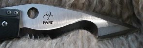
Recently I've acquired a Steve Ryan Biohazard M1 and I find his blade markings entirely acceptable and to the point.
 

Attachments

  • ryanlogo1.jpg
    ryanlogo1.jpg
    20.5 KB · Views: 159
A logo or tang stamp is ok. Steel type could be discreetly marked. All other writing only cheapens the knife.

Paul
 
I certainly agree there is entirely too much writing on the blades of too many knives. Slip joints often have the worst of it, because so man of the blades are quite narrow. I've looked fondly at the design of several Bulldog knives, but have refrained in part due to the writing on the blade.

Just last night, I saw a knife I really liked in the AG Russell catalogue. It is a 5" Schatt&Morgan Texas toothpick design. 4" long, slim blade with "File and Wire Tested" and ATS34 etched onto the obverse side of the blade. The writing makes it much more obvious that the S&M badge on the scale is seemingly upside down. At least you have to turn the knife over to properly read it. What's with that? A beautiful pattern, graceful as the dickens, and this large writing and a bit of small as well.

Of course, like in everything else, one can vote with their dollars. But, if nobody tells these companies that the reason one isn't buying their knives is because of the writing, they go on doing it. I honestly think that I'm going to start communicating my dislike of the writing to the manufacturers/sellers. If lots of people did that, they might pay attention. An occasional lone voice in the wilderness is simply going to be perceived as a crackpot and ignored. Please help me avoid being labelled a crackpot!
 
You are right on the money. I don't mind a small logo or makers name but I can live without the entire history behind the knife written on the blade. Just send me a nice book along with the knife to tell me all about it.
 
Got to agree about there being to much writing on blades. I had one of the first 500 Buck Stiders. These were the only ones made in BG-42. If it had a stamp that said BG-42 that should have been all that was needed to let everyone know it was one of the first 500.
 
Back
Top