-
The BladeForums.com 2024 Traditional Knife is available! Price is $250 ea (shipped within CONUS).
Order here: https://www.bladeforums.com/help/2024-traditional/
You are using an out of date browser. It may not display this or other websites correctly.
You should upgrade or use an alternative browser.
You should upgrade or use an alternative browser.
An open and honest conversation about product photography in the custom knife world.
- Thread starter Los Angeles
- Start date
")
- Joined
- Oct 28, 2006
- Messages
- 13,363
I guess the question comes down to what % of potential knife buyers is truly interested in big, detailed, non-Photoshopped pics
You guys tell me
Is having clear, big pics important to you when making a online custom knife purchasing decision?
I prefer not to purchase a knife without seeing/handling it first, however if I do consider purchasing a piece off the Internet I want BIG clear photos which realistically represents both good and bad features of the knife.
I obviously don't see/handle my commissioned knives before committing to purchase, however when commissioning a knife I know enough about the maker and the knife that I feel perfectly comfortable not seeing/handling it in advance.
- Joined
- Dec 5, 2005
- Messages
- 28,890
I obviously don't see/handle my commissioned knives before committing to purchase, however when commissioning a knife I know enough about the maker and the knife that I feel perfectly comfortable not seeing/handling it in advance.
impossible to do, as they do not yet exist!
(but the anticipation kills you, especially when you see pictures of the thing getting built!)
- Joined
- Oct 8, 2001
- Messages
- 12,348
In the OP's original post, he was alarmed at the usage of vibrant color to compete with a knive's look. (At least this is how I perceived it.)
My experience: I have found that knives lacking in color benefit the most from the introduction of color.
Here's Phillip Patton's stunning half-sword with my background I have nicknamed 'PBS Yellow'") (You gotta laugh, Kent!)
(You gotta laugh, Kent!)

The same image with a completely desaturated background with the exact same colors/contrast in the knife:

If you were looking to display your work proudly, of these which would you choose? An extreme example, but that always help clarify a point.
With a knife this large, my selection of backgrounds is VERY limited. I chose what I felt would give it impact, and had the capability for insets.
Coop
My experience: I have found that knives lacking in color benefit the most from the introduction of color.
Here's Phillip Patton's stunning half-sword with my background I have nicknamed 'PBS Yellow'
(You gotta laugh, Kent!)
The same image with a completely desaturated background with the exact same colors/contrast in the knife:
If you were looking to display your work proudly, of these which would you choose? An extreme example, but that always help clarify a point.
With a knife this large, my selection of backgrounds is VERY limited. I chose what I felt would give it impact, and had the capability for insets.
Coop
- Joined
- Dec 5, 2005
- Messages
- 2,018
I am NOT a photographer. I am NOT an artist. However, I think that the second photo is a perfect example of the background taking away from the subject. In fact, both backgrounds take away from the subject. It is not the color that is the problem, it is the texture of the background. In the second photo, the pattern of the blade melts into the background and becomes indistinct. This picture does need some color, if for no other reason than the gloss of the hilt and the shine of the guard would be lost in a white background. I'm not sure, however, that the yellow textured background is the right fit for this subject. But, then again, I AM NOT AN ARTIST.
- Joined
- Sep 7, 2006
- Messages
- 6,214
Interesting thread! I must admit I find some of these pics a bit artificial and I too prefer natural light. That said, the pics are often serving as a commercial for the knifemaker, it is a selling tool after all, and therefore some airbrushing is only to be expected. If you think the models in women's magazines really look like that, well think again!
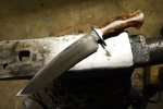
As an example of the type of photograph I really like, I present this one. I dont know who took it (I think the maker might have) but I really love it. It shows the knife off in all its glory but it looks entirely natural and realistic - the dirty floor and all! And the prop is, of course, entirely appropriate.
Of course, using the same background over and over again would get boring quite quickly, which is where I can totally appreciate the work that pro photogs like Coop do. It aint easy keeping it fresh and doing something interesting for each piece, especially under time pressure.
Attachments
- Joined
- Feb 28, 2002
- Messages
- 13,348
^^^ That's the maker's photo. Tad seems to get rather good results just laying his knife on his anvil and pointing his camera in the general direction.
On Coop's photo above, I don't find the yellow textured background the least bit distracting - I think it serves to make the images of the knife really pop. here's another "black and white" knife that shows well on a colourful background:

Here's the same knife on a more neutral grey background:

Of course, we're comparing a pro shot with my own shot, but I think the stronger colour in Coop's background makes for a better showing of the knife even if all else were equal.
And I'm not knocking the grey background - it's Murray's and has served very well indeed for the majority of the knife photos I have taken. But I think Coop makes a valid point about knives "lacking in colour" that benefit from a coloured background.
Here's another example of that very thing from Caleb Royer:

Roger
On Coop's photo above, I don't find the yellow textured background the least bit distracting - I think it serves to make the images of the knife really pop. here's another "black and white" knife that shows well on a colourful background:
Here's the same knife on a more neutral grey background:
Of course, we're comparing a pro shot with my own shot, but I think the stronger colour in Coop's background makes for a better showing of the knife even if all else were equal.
And I'm not knocking the grey background - it's Murray's and has served very well indeed for the majority of the knife photos I have taken. But I think Coop makes a valid point about knives "lacking in colour" that benefit from a coloured background.
Here's another example of that very thing from Caleb Royer:
Roger