Boy there's a lot of good stuff being talked about here. This has been my SECOND passion in the knifeworld.
Blade 747 - what's the raw pixel depth and height and width that comes raw out of your camera? What is the final pixel depth, height and width? I'd like to relate this to the rest of your tutorial.
Not 100% sure what you mean by depth. The above raw image was shot at 1280x960 resolution. (Even though I can take it at 2400 I've found it doesn't make any difference once I downsize to 640. More on this later...) The raw image was 563kb.
Once downsized, cropped, and saved at 60% compression, that image is only a skinny 42kb. After my enhancements, it increased the file size back up some, to 68kb for the same size shot. It has a lot of refinements that come at that cost.
It's been told to me and I believe it, that anything upwards of 60% compression isn't noticable to the eye. Under this it starts to become slightly apparent. Most image programs provide some method of adjustment or selection.
Dan (Pendentive) wrote: Have you tried "Adjust>Levels" and used it manually? I've had much better results compared to "AutoLevels".
I'm surprised to see the pixel reduction saved for last. It's been my understanding that every save to a jpeg image deteriorates the quality by X%.
Dan, I am plenty familiar with the 'Level's' controls. I usually try the Auto button first, and look it over. If I don't like what I see, I go in there and do it manually. in fact ALL of the visual settings I used up above are under constant readjusting for each picture I work on. This was an attempt to do it in the least amount of steps as to be explainable to all. MOST programs have some form of 'Auto Adjust' button, and I wish folks to use it.
For those of you out there that don't have Photoshop (which is a $700 program!!

), some of this conversation is indecipherable. Sorry.
Regarding degradation, I have heard these tales too, but I have yet to experience or see an example of how it applies. Maybe I confused you. The last thing I do is go to the 'Save for Web' window (which is Photoshop's method of finalizing a .jpg) and resize it there (not in the image program), as well as adjust the file compression.
Murray: you made it better than my original, but my monitor shows quite a bit of yellow. As Boink pointed out the differences in monitor output alone makes all of this very subjective, right? BTW--I bought and use an NEC 21" monitor seven years ago, and it's the BEST computer investment (?!) I ever made. It's outlived two major computer upgrades.
I will give your pictorial a shot at enhancements. Thanks for taking some serious time giving us the differences in various knives and backgrounds to see the effect they have. This is FUN!
Now if any of you folks are still paying attention, I wrote a lengthy experiment on the differences between some VERY high-profile ($$$) camera's and some not-so-costly ones, and the effect they have on output for a web-sized picture. If THIS is the medium you want to work with, you will be pleasantly surprised at what I learned:
Resolution Comparisons This could save you BIG money on a camera for the future.
Lastly where's MY HERO

, PhilL who is my image mentor? I owe much of my learning curve to him! He's chuckling in the background...
Coop
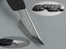

") It definitely has creamy scales and a bluing of the bolsters. Please let it be! That is a Frank Potter auto, btw.
It definitely has creamy scales and a bluing of the bolsters. Please let it be! That is a Frank Potter auto, btw.

")


