Input Wanted - M. Jones Logo Help

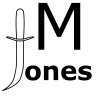
I like "69 knives" idea to place the "M" in side the loop of the "J". Takes up less space and appeals better to me, IMO!
 
Last edited:
How about a totally different concept than my signature. This one is for you, Jack :p

attachment.php
 

Attachments

  • jones2.jpg
    jones2.jpg
    20.7 KB · Views: 65
The only problem I can foresee is with the large elements mixed with the small elements. If you scale the height to 3/8" the small letters will be about .030"
 
I printed it out and measured, and the "ones" is 1/16" tall, and very legible on paper. I'm not sure how that would turn out on a knife though.
 
I like the knife for the ' J ' , but of course I would . How about using Michael instead of the big ' M ' . Don't make the letters so BOLD .
Just my thoughts . My wife drew my mark about 18 times , some may not like it but I do . I just like to keep some things simple , you want the buyers eye to see your knife 1st , then the mark .
 
Maybe I should just do a regular font of M. Jones to start, and then if I wanted to later, after I got my name out there, I could change it.
 
Maybe I should just do a regular font of M. Jones to start, and then if I wanted to later, after I got my name out there, I could change it.

Just keep playing Mike , you will get . Probably sometime around 2 am. while you are dreaming about it . And you will love it so much you won't go back to bed until you have it drawn out .
 
Start looking at the MS's makers marks. Most are very understated and have a name rather than a logo or "graphic" element. They let the work speak - not the makers mark.
 
This is the one I just got from Ernie yesterday. it looks big even at only 3/4" wide, well, it seems to look bigger in the pictures but I really like how it looks on the knives.

logo.jpg
 
Mike,
In my opinion you'ld be ok with "script" if you increased the size of the "ones" to make it more legible at etching size. I'd shoot for lower case lettering to be half the height of the M and see how it looks. I'd also really like to see you disconnect the "o" from the "J". Thats a personal preference but to me going cursive style from the J to the O is clogging up the works visually. Oh yeah, definatly keep everything in a straight line :thumbup::thumbup:

-Josh
 
I printed it out and measured, and the "ones" is 1/16" tall, and very legible on paper. I'm not sure how that would turn out on a knife though.

I double check my math and somehow I used 3/16 instead of 3/8...

so your measurement of 1/16 height is correct.
 
Mike,

What's it look like if you put the "M" in front of the Jones (with the knife for a "J")?

I too, think the simpler the type face and layout is the better it will be.

All the best, Phil
 
These are the two that I have now. Disconnected the J from the o, and then on the other one, put the M to the left of the J-shaped knife.

attachment.php

attachment.php
 

Attachments

  • mjones21.jpg
    mjones21.jpg
    16.9 KB · Views: 26
  • jones5.jpg
    jones5.jpg
    13.2 KB · Views: 26
Mike,
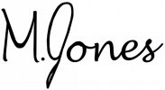
:thumbup::thumbup::thumbup::thumbup: for the top design. If it were me I'd stay away from the knife shaped J . Just MHO

-Josh
 
Thanks Josh and 69. I wasn't sure how it would turn out, but I thought I'd give it a try.
 
Well Mikey , I must admit , I do like the top one better ( many reasons ) , what bothers me is the ' M ' looks like your iron gym and I can't do a good ' J ' for the life of me and I have been signing one for many yrs. Now , add handmade or hand crafted underneath the name . I liked how 69 added that .
 
Now the question is what should I put underneath it? Knives? Handmade? Hand crafted? Cutlery? And I'll work on the M a little more
 
Now the question is what should I put underneath it? Knives? Handmade? Hand crafted? Cutlery? And I'll work on the M a little more

It is obviously a knife . Hand crafted , handmade , hand forged , your state , or nothing at all . See what you think .
 
I like the top one as well. I am also in the process of getting my stencils designed. Ernie Grospitch is a great help.

I was going to have "knives" added in there somewhere, but decided not to since it seems obvious that it is a knife (thanks again Ernie). The M.Jones above looks great. I'll have to eat crow from my previous post. Ernie suggested a lone star on my stencil and I think it it looks good so you might like a simple graphic element that represents your town, state, etc. I also decided to put my city and state on the bottom in smaller type.

Mike, I am just throwing some ideas out there. I re-read my previous post and I think I may have sounded snooty or rude. I sure didn't mean to. Anyway, best of luck.:thumbup:
 
Back
Top