I agree. Some elements just don't work on a knife.
For example, no matter how religious you are, a cross on a knife seems out of place. Same goes for puppy dogs and kittens. Likewise, I think a chicken foot just doesn't seem right on a knife blade.....unless your name is Brian Birdfoot - then it would mean instant recognition - like John Deere's deer and Fred Bear's bear....or Tony Hawk's hawk (My son used to skate with him) .
If you really like the logo ( and there is nothing wrong with it), you might change the wording to "NOT FOR CHICKENS". That would tie in the symbol to the knife. You could move the "CUSTOM MADE KNIVES" under your name on the other side. This would allow you to just use the BD/CMK mark alone if needed. The words "NOT FOR CHICKENS" should be above the foot ,and as large as will fit. (See next statement)
Another problem with the logo is size. Things look pretty good in 12 point type and at 3" tall. But,looking at the 1" image on my screen, I can't make out "CUSTOM MADE KNIVES". Shrink that down to 1/4" and see what you get. The chicken foot will be fine, but the CMK will be microscopic. Even at 1/2" tall, I don't think the writing on your logo will reproduce. Print out your logo and reduce it on a copy machine to actual size, and see how it fairs.
Also, remember that a person looking at the knife most likely never met your grandfather, or has any idea that it is a family symbol.
All this is just my take on it. Everyone has different opinions and values, so mine do not trump anyone's. If the logo is suitable to you, then let no one cause you to change it.
Stacy
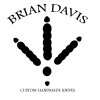

") Seriously though, I think it's a cool logo and I'd go with it. This is certainly no more strange than having a logo of a horse, or a sparrow, arrowhead, etc. The chicken foot is actually a little more interesting if anything. I will agree with the idea of the logo on one side and your name on the other. Logo looks good though brother! Run with it.
Seriously though, I think it's a cool logo and I'd go with it. This is certainly no more strange than having a logo of a horse, or a sparrow, arrowhead, etc. The chicken foot is actually a little more interesting if anything. I will agree with the idea of the logo on one side and your name on the other. Logo looks good though brother! Run with it.