new logo option

Joined
Jun 11, 2006
Messages
8,651
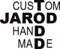
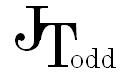
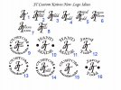
I have been thinking about redoing my logo to include my name. it seames that all the real popler makers use there name in there logo. i wanted somthing simple but discriptive. but i also needs to look good on a knife. my old logo was just JT with the T shifted down and a little over so it tuched the J. but i wanted people to know my kname when thay see my knives. so any feed back or ideas are very welcome.
 

Attachments

  • logo.jpg
    logo.jpg
    9.5 KB · Views: 9
One problem I see, is it could be read as either Jarod Todd or Todd Jarod. I read the Todd first.

Also, the alignment looks completely random.
 
I agree, the alignment thing is not optimum. It looks forced to me.

I think the JT is good, simple and easily recognizable.

If name recognition is important to you, I'd suggest you drop the little logo thing all together and just use your full name. It's unique and an easy one to remember all by itself.

...my 2 cents.
 
I agree its too busy and misaligned. My suggestions:

-Keep the name font at least twice as big as 'custom hand made'
-dont try interlinking the words.
-Add character by slanting the text or trying a new font

If I was you I would keep the J and T in similar arrangement, and add the rest of your name in slightly smaller font, and then write 'custom hand made' underneath in same or slightly smaller font but distinctly different font, possibly cursive or calligraphy sort of thing.

If you are already well known as JT you should try and retain that as the 'skeleton' of your logo.

Good luck

Lang
 
JT there are lots of smart people that do this type of thing for a living, maybe offer a free knife for a logo type deal. I did exactly this on another forum and stuck gold....just a suggestions.

Good luck
spencer
 
Jarod,,the picture you showed us would make a great business card,,
but if you plan on branding it on a knife,,it might cause slight "halo" around each letter which might look very fuzzy,,,,
i made the mistake of putting my name on the top line,,,the word "Maker" under that,,,and then on the third line under that i put my city and state,,

Last year i droped everything but my name,,and it looks so much better..
good luck
Skip
 
I think im just going to keep the jt. all my knives i have made from the very first one have had the jt on it. i wasd just seeing if somthing else would work. but why change a good thing. also i could just add " MAKER " under the jt if i wanted. thanks for the help.
 
Hay JT
with your name on the blade,,everyone knows your the maker,,,the word "maker" under it is a bit redundent,,,(words of wisdom told to me by a knife hall of famer)
Skip
 
I was thinking about just using th jt but above it put HAND and have it curve down on both sides. and under the jt put MADE and have it curve up on poth sides. Or i could just keep the jt but after the T put odd in smaller text so it would be like this.
 

Attachments

  • logo1.JPG
    logo1.JPG
    1.8 KB · Views: 4
  • logo 2..JPG
    logo 2..JPG
    1.9 KB · Views: 120
O and one more. i could also put my first name as well.
 

Attachments

  • logo 3.JPG
    logo 3.JPG
    2.3 KB · Views: 118
ok i have spent some hrs with photo shop and this is what i have come up with i like them i think thay look very nice and clean. i put numbers by them so you can say i like this one. thanks for all your help with this. let me know which one pops and sticks in your mind. thanks
 

Attachments

  • logo comps.jpg
    logo comps.jpg
    54.2 KB · Views: 42
i have never made a knife
i have never made a logo
the advice i have works in most situations
K.I.S.S.

i like #1, BTW
 
lol,,,JT ,,,your having to much fun with this,,
i like the top one posted at 4:32pm
C-Ya
skip
 
I think the posting times show up different for me so I cant refer to a certain post...

The logo you did with cursive and your name and surname smaller is exactly what I had in mind. I like, I think that rocks. Possibly move the T slightly away to the right from the J , and also see how it looks if you move the 'odd' part slightly up to fill that little gap. Though I think it will probably look better at the current height.

Have fun.

Lang
 
Back
Top