- Joined
- Jun 11, 2006
- Messages
- 8,651
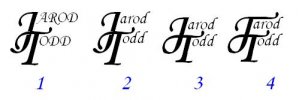
ok is this what you mean. i kinda like it with the J sweeping into and conecting to the T. but i had the change the font and lengthen some of it so it would fit and leave enought space between everything. i think i like #3 or #4 the best, it just catches my eye and seames like it would not be to hard to put on a blade with a stencle and my etcher. thanks for all the comments.