- Joined
- Dec 7, 2008
- Messages
- 7,187
OK.....I am just ranting here. Please just take this as my opinions and maybe food for thought.
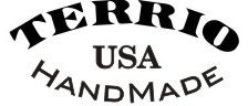
I have seen a number of good looking knives where I was annoyed by an oversized makers mark.
My first thought was that looks like a Nascar logo.
When I look at the bigger name makers I see their makers marks are smaller and more conservative.
As for embellishment.
A little bit can be good, but too much is too much.
I am talking about excessive filework, multiple mosaic pins and clashing handle materials. Makes me think of third world made flea market knives.
These all require extra work and expense, and in my opinion can severely limit the market for the sellability of the knife.
My thought is that a well made, clean and semi conservative knife will always be a better seller.
It takes a lot of little things to make a knife look really good.
But just one little thing can make it look bad.


")
")