Your thoughts on maker's marks

Personally, I prefer stamps over etches, the darkness of the etch tends to wash out over time especially on carbon steel.

I also really enjoy symbols and icons. If its just a name I like when its in a crescent shape on the ricasso facing away from the pommel.

Here are two from my collection that I like - I also would prefer these two to just be the Sunfish and Rose, but I accept whatever the maker choses.


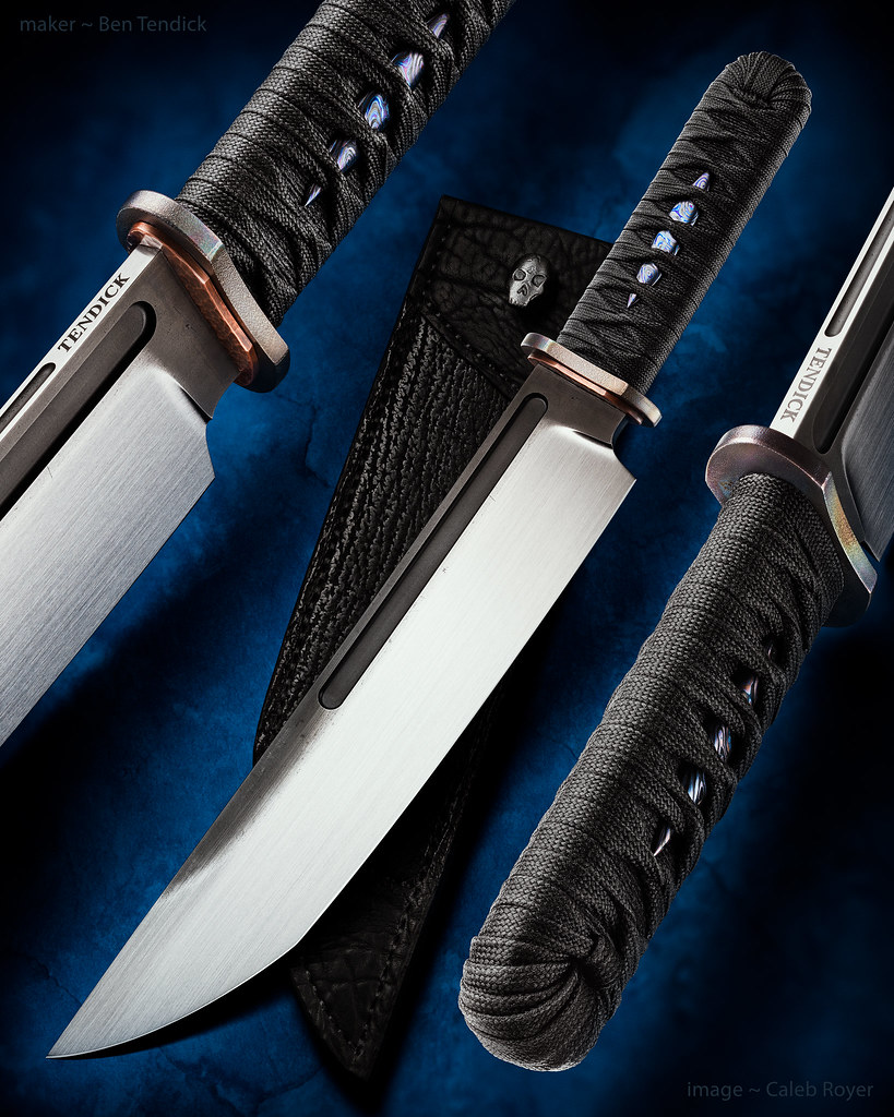
I use either my logo or last name. Pretty sure I'm the only Tendick on the planet making knives, so it works for me. My Logo is simple, and inspired by cattle brands with my Initials. BRT.

I see some saying they prefer stamp over etch. A deep DC etch is just as permanent and almost as deep as a good stamp.

I like a simple symbol or the makers initials done in a symbol

Ben does a good job


Thanks Joe, you have the only stamped Kraiken and Oregonto out there. : )

Just my name.....


My Mark etched....some people prefer the subtle small logo
 
Here is an example of what I meant when I said the etch kind of washes out. I've had this piece from Nick for about 4 years and you can still clearly see the etch in the surface of the steel but the boldness of it as a marking has faded. When done properly stamps seem crisper and bolder and seem to hold that edge longer :).... at least to my eye.

 
Last edited:
Naah, Rick - I almost view you as an exclusion to the rule, because you have a distinctive style in all of your knives. That 'look' is more of your maker's mark than you maker's mark is, I'll wager.

Agreed....spot one across the room. There's never any doubt when I handle a Marchand. :)


Sent from my iPhone using Tapatalk
 
Personally, I prefer stamps over etches, the darkness of the etch tends to wash out over time especially on carbon steel.

I also really enjoy symbols and icons. If its just a name I like when its in a crescent shape on the ricasso facing away from the pommel.

Here are two from my collection that I like - I also would prefer these two to just be the Sunfish and Rose, but I accept whatever the maker choses.


Nice to see that one getting used! Thanks.
 
I really like Sam Taylor's mark, (Mecha);


usually really like the look of a stamped mark. Not always, but when they're done well they can be very complimentary to the knife
my buddy, Magnus, has a pretty neat mark as well. I'm pretty sure it's machined;

 
I also would prefer these two to just be the Sunfish and Rose, but I accept whatever the maker choses.


I like both of these marks a lot. Don started using his combo Hanson/sunfish mark on slipjoints only a few years ago. You will just see the sunfish on everything else.

Sam Lurquin's mark is another favorite. :thumbup:

- Joe
 
I use this one still but it is also fun to have something a little different too
tqRfmqg.jpg

l6BKv4v.jpg

YAEFdGJ.jpg
 
I really like Sam Taylor's mark, (Mecha);


usually really like the look of a stamped mark. Not always, but when they're done well they can be very complimentary to the knife
my buddy, Magnus, has a pretty neat mark as well. I'm pretty sure it's machined;


Thanks Lorien. :] The atom mark often comes out lopsided or poor, because it's four marks overlapping: a dot, then three small ovals, which have to be made when the blade is red hot. It's hard to see what's going on and align the tiny oval over the dot, when my glove is about to burst into flames. The nicest ones look three-dimensional, and when I get a single punch made (hopefully soon) it will be a copy of one of those 3D "perfectly imperfect" marks.
 
I enjoy a clean, crisp Makers Mark that consists of the Makers name.....over the years I've acquired a number of knives with a 'mark' and cannot remember who's it is.....have to do some research to know what I've got.

I have gotten very few knives over the years from makers who are not well known(mostly not in the Knives Annuals, and the fact that they have listed "maker's mark" types over the years is extraordinarily helpful, even with access to the collective mind that is the Internets) that have initials stamped in. Usually wind up giving them away out of frustration to folks who will happily use them, and then don't have to worry about it.

Newer makers who have not established themselves should really question "how will a computer-challenged, non-knife person know who made this knife?"...it's highly important, if only for follow on sales.

I don't have ANY preference between etch or stamped marks....I do prefer that they be spot on in terms of location, size and legible quality. Being that it is one of the last things that many makers do before final finish, I HAVE purchased knives with maker's marks that may not have been so spot on, because I liked the knife a lot, and possibility of getting another one was low.

This is the last contribution that I'll make to this thread, as I plan on starting another one of a related subject that ties in nicely to this subject. It's been a fantastic discussion and I thank Lorien for starting us on this path.

Best Regards,

STeven Garsson
 
Last edited:
Awesome logo.
I wasn't going to DARE post in this thread, but Joe made it ok. :D

My glyph looks like a stylized dagger horizontally, but vertically it reads 'Au'. My last name is 'Gold'. I have versions with and without the 'USA', and one that looks more like the classic symbol from the periodic table. I recently got some smaller ones as the original one was overpowering modest-sized blades.

IMG_20170121_110224-small.jpg


IMG_20161202_162215-small.jpg
 
Interesting discussion. I've considered a stylized logo for my tactical line...any thoughts on having two marks for two different genres?

I've been working on this very thing Ben... I'm not sure if or when i'll ever start two separate lines of knives but I definitely want to at some point and I would like to differentiate between the two regardless of it being the same maker or not... and I may end up doing a semi production run at some point and if that happens I don't want the same mark on the knives I do 100% by hand.


edited to add: I should have read the entire thread before commenting... that being the case, I did finish and how have to admit I pulled the trigger too early on that one, lol.


that being the case, I guess i'll comment on the rest of the points as I remember them:

My last name is Roberts and unlike "Tendick" Roberts is a fairly common name and I wanted to separate myself so I etch my name spelled backwards, as it's way less common and from what I found there are zero other makers named "Strebor" (pics when I get home and remember).
I also wouldn't mistake a Marchand knife for anyone elses design that I have ever seen as IMHO, unique beats a logo for recognition all day... same goes for Lurquin as I didn't really look at it as an "S" till now but I have never wondered who made one when I see them. To me, I think simple and clutter free is the key regardless of whether its a pic or a name.
 
Last edited:
Just throwing it out there...
You could just use your name spelled correctly but applied to the blade in reverse or mirror image.
That would set your Roberts apart from the rest.
 
Just throwing it out there...
You could just use your name spelled correctly but applied to the blade in reverse or mirror image.
That would set your Roberts apart from the rest.

I used to work in a job where I was supposed to stay out of the public exposure for op-sec or whatnot, so it was a nice way to distance myself and keep off the radar but still tie myself to the knives from a distance... now it doesn't matter but it kind of grew on me
 
This is the last contribution that I'll make to this thread, as I plan on starting another one of a related subject that ties in nicely to this subject.
I've been drumming my fingers in anticipation for days now. Open up! :thumbup:
 
BTW, I have decided after looking through MANY marks that my VERY faves are the ones which incorporate a visual icon of style as well as a name. It can include BOTH!

orig.jpg


Most are explanatory. Michael Zieba has a strong name mark, yet he also uses a 'feather' on occasion.
 
Back
Top