Different Look and Feel Forum

The forum does seem quicker. 1/3 of the first page is taken up with stickies, Anything to be done about that? Wonder if this could be changed or improved in some way. Condensed, separate link or highlight/color them in some way so that getting to the first real post is more obvious. Or am I just a voice of 1?
 
Last edited:
The forum does seem quicker. 1/3 of the first page is taken up with stickies, anything to be done about that. Wonder if this could be changed or improved in some way. Condensed, separate link or highlight/color them in some way so that getting to the first real post is more obvious. Or am I just a voice of 1?
I'd be happy to see that change as well. There is an airgun forum in the UK that does this very nicely on their website.
 
The forum does seem quicker. 1/3 of the first page is taken up with stickies, anything to be done about that. Wonder if this could be changed or improved in some way. Condensed, separate link or highlight/color them in some way so that getting to the first real post is more obvious. Or am I just a voice of 1?
I noticed the same thing. Figured maybe they just hadn't got that far down the priority list of bugs to fix yet.
 
Just s little caught up in this change piling on all the others, i.e. change in both top BCCI leaders, Mrs. Buck voted off board, new company president, loss of Houser inhouse (I support a fellow retiring but will miss shadow on the floor), and early in year the discontinued 309. It just seems to be change just to be changing. Theirs more room to type but less lines on a page. I am just slow to make changes be a part of my 'function',
 
The forum does seem quicker. 1/3 of the first page is taken up with stickies, Anything to be done about that? Wonder if this could be changed or improved in some way. Condensed, separate link or highlight/color them in some way so that getting to the first real post is more obvious. Or am I just a voice of 1?

I agree, Roger. It's hard to quickly determine where the stickies end and the first post begins. Also, each page is enlarged which requires more scrolling. It is especially noticed on the main page that lists each forum. Example: If you're on the main page and want to visit The Great Outdoors forum, ya better pack a lunch.
 
I agree, Roger. It's hard to quickly determine where the stickies end and the first post begins. Also, each page is enlarged which requires more scrolling. It is especially noticed on the main page that lists each forum. Example: If you're on the main page and want to visit The Great Outdoors forum, ya better pack a lunch.

I agree....
Both, Too Much scrolling on Pc, & Devices

Also I keep hitting the like button, cause I can't tell I already did it!
 
Noticed another missing feature. On the left under username, the old format displayed date joined, post count, and location, which I mostly used for quick reference to welcome new members. Now, you have to click on the avatar to retrieve that information - an additional step I'm probably too lazy to take. :(
 
Last edited:
I haven't figured out pics yet. if I attach pic doesn't actually attach. if I use the drop add drag tab on top it comes back with we ran into some problems. 🦧

good news is my pics weren't so good, so no ones gonna miss anything.🐵
 
Is it ok for me to post a screenshot from another forum using the same software?

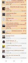
Here is the color scheme that I think works well...
Screenshot_20210430-105512_Samsung Internet.jpg
The Stickies are highlighted nicely and it's easy to see the newest posts. Here's how it looks in Android Dark Mode...
Screenshot_20210430-105529_Samsung Internet.jpg
 
Back
Top