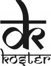
OT: Need some input on my makers mark

Most of the knives I make....work on....etc....are ethnic, regional, traditional types. I like goloks, the seax, puukkos and, of course, khukuris.

So, I need something that at least hints at being exotic. That's why I like the somewhat oriental feeling of this logo - but it's too much. And now it has too close a similarity.

More ideas, please....:o
 
i thought that looked kinda familiar, but just figured it was because it didn't look like anything. ya know, like ICS37 said, a subjective Rorschach inkblot;) I dunno what would look good. That idea had me sold. It looked tribal or maybe like some sort of cuneiform or ruin. I've tried scribbling down a couple of things with the D and the K. Like extending the K arm and leg out from the straight part of the D, but it just doesn't look very cool. You have to be careful doing stuff like that lest you want your knife to look like a monogram bath towel. Dan, do you have a particular "flagship" knife that you have made, enjoy making, or will be making more often than others? Maybe instead of the mysterious you could just go with a visual branding of your product. That is to say, mark your blade with a little image of your flagship model with "Koster" over the etching of the flagship blade.
Or maybe a regal look with a shield devided diagonally with a fancy D in the upper left and a fancy K in the lower right with a with a blade crossing behind.
i dunno. Just throwing out ideas. I guess it will come down to what you want your knives to stand for. Toughness? beauty? quality? Utility? IMHO, i would make my mark fit whatever i was trying to hang my hat on.

Jake
 
If you made primarily khukuris, you could etch a nice crossed pair of them on one side, and KOSTER on the other... I think it would be very classy!
 
Dan, here is my suggestion.

take care,

Tom
 

Attachments

  • Koster logo.jpg
    Koster logo.jpg
    20.4 KB · Views: 3
that is pretty cool, Tom.

What if it had more "crisp" lines (vs. curvy) and no "---" across the d & k?
 
Tom?

Perfect...er...'cept


open up the "k" in both places, it looks like an "r"

sharpen the broad upstroke to knifepoint, it looks like a tanto point right now.

I'd stamp rather than etch. The etch work could be as tedious as making the blade.

It is perfect.
 
what about something more like this?
(quickly roughed out in MS Paint....:o)
 
maybe you could help me straighten it out a little, Tom?

I was thinking the bulb of the "d" could be higher....try that one too. I'll see what I can come up with this evening.
 
I like it, Tom:) the only thing i'd change is i like Dan's curvy k legs a little more. But that's just me:)

Jake
 
Steely_Gunz said:
I like it, Tom:) the only thing i'd change is i like Dan's curvy k legs a little more. But that's just me:)
My 1st impression was that the d & k were 2 diff typefaces.

~
~~~~~~~~~~~~~~
<>call me
'Dean' :)-FYI-FWIW-IIRC-JMO-M2C-YMMV-TIA-YW-GL-HH-HBD-IBSCUTWS-TWotBGUaDUaDUaD
<> Tips <> Baha'i Prayers Links--A--T--H--D
 
I wish I had a creative idea for you..my accountant gene is taking over..nothin'. .... The only thing I can think of is wingdings font. :D

Your first two look pretty good, simple but unique.
 
second attempt was to different fonts.

I am not great with corel draw yet. Will work on it some more later. One more coat of arms to finish tonight first.

Tom
 
Just *please* don't design blades just so they are big enough to hold all of the verbage (MOD type). My $.02...a knife should speak for itself, not be buried under marketing hype.
 
Dan,

I also wanted to say that the first mark you posted is also used by comic artist Del Keon(sp?). I used something similar on all my paintings, just with a B instead of a K. Now I just use a large fancy D.

I really like the second one you posted.


- D
 
Back
Top