- Joined
- Dec 5, 2005
- Messages
- 28,586
that would be my guess as well. I like it either way, personallyMaybe it removes one production step if it’s only on one side?
The BladeForums.com 2024 Traditional Knife is available! Price is $250 ea (shipped within CONUS).
Order here: https://www.bladeforums.com/help/2024-traditional/
that would be my guess as well. I like it either way, personallyMaybe it removes one production step if it’s only on one side?
I had not mentioned it before, but I agree. I certainly appreciate the reason behind why it was moved, at least what I think the reason was. There is a lot happening on the left side of the knife now, and nothing on the right. The old method had a nice balance, with a solid name anchoring both sides, sort of like Nathan has your front,and Lorien has your back.
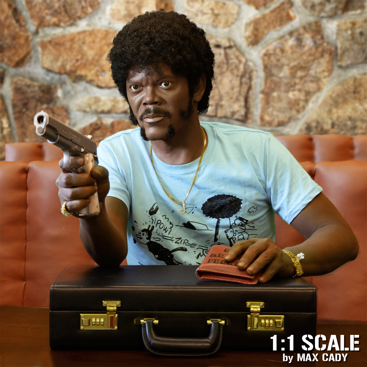
Not if we're being screen accurate☝︎☝︎☝︎☝︎☝︎
Nice, but there is a word missing. Maybe there wasn't room, but shouldn't it read badass? Maybe a smaller font?

How about an abbreviation? BADASSMOFO?

I don’t know, We already have a Uncle MoFo. AKA Uncle Maty.

I don’t need another EDC, I don’t need another EDC, I don’t need another EDC...
But they’re so hard to resist with that sexy swedge and and delicious new handles!

Be safe out there! Too cold!Moving when it's -17° with a wind chill of -37° is not without its humorous moments.
View attachment 1063865
Weather here today - a low of 52 and high of 63 - currently 59.
