Thoughts on logos and maker's marks (Criticism needed)

Joined
Jun 22, 2016
Messages
1,627
I'm in the beginning stages of an upstart small knifemaking endeavor. Materials, logistics and labor are all lined up. We've decided to call this "brand" if you will, Valdyr (Old norse for wolf) Designs and I have been tasked with creating a mark. We only intend on doing defensive blades, but with a rustic "Viking" look. All of the designs thusly reflect that.

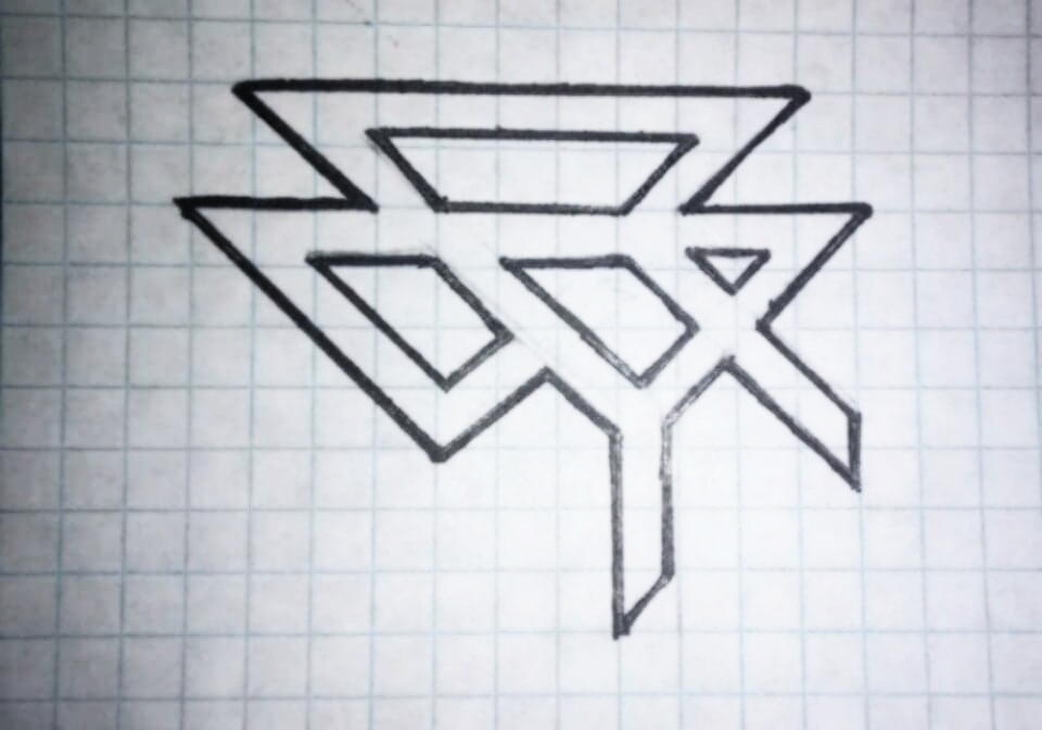
I'm looking for some critique on my most recent go at it. I know, it's unintelligable, but it spells out "VALDYR" in a few different ways, and has a runic look:

Any thoughts are appreciated.

Valdyr1182737260544_n.jpg
 
If the name of your company means "wolf," perhaps the logo should at least have the hint of imagery from a wolf?

You can even see how a wolf's face, head on, has a very "V" like appearance, so I'd imagine someone more artistic than me could incorporate a wolf's facial features into a central "V" to promote your brand and the image.

A few shamelessly stolen examples, grabbed by doing a Google Image search for "wolf face."


s-l300.jpg
5240b49f956569349e57ade279d7a2c0.jpg


Edit to add: I guess, to be fair, what I posted above isn't really what you asked for, OP. If the unsolicited advice is not welcomed, I apologize.

To answer the question more directly, I kinda see what SpySmasher SpySmasher is talking about. That type of imagery has been corrupted unfairly. Which is a pity because I think it's very cool looking. I think the logo as it is, isn't going to be useful to your company because, while you are looking for all the ways that logo spells out the company name, to everyone else, it's a bunch of lines.
If the company logo isn't going to spell out the company name, Id think it would probably serve well for it to be something that reminds one of the company name, i.e. the spider logo for Spyderco. Hence my suggestion above for the wolf, with a pronounced "V" incorporated into the face.
 
Last edited:
Not crazy about the unintelligible mark. Imagine people seeing a picture of one and trying to figure out how to get one. If the design is alongside the printed name, then sure.

What about a wolf head, since it means wolf. Next to the name, of course.
 
names and logos have less interest to me than the knife itself.

logo as shown, doesnt seem bad. doubt I'd ever figure out what it is though on my own. dont know if that has any bearing to what youre shooting for?
 
If the name of your company means "wolf," perhaps the logo should at least have the hint of imagery from a wolf?

You can even see how a wolf's face, head on, has a very "V" like appearance, so I'd imagine someone more artistic than me could incorporate a wolf's facial features into a central "V" to promote your brand and the image.

A few shamelessly stolen examples, grabbed by doing a Google Image search for "wolf face."


s-l300.jpg
5240b49f956569349e57ade279d7a2c0.jpg


Edit to add: I guess, to be fair, what I posted above isn't really what you asked for, OP. If the unsolicited advice is not welcomed, I apologize.

To answer the question more directly, I kinda see what SpySmasher SpySmasher is talking about. That type of imagery has been corrupted unfairly. Which is a pity because I think it's very cool looking. I think the logo as it is, isn't going to be useful to your company because, while you are looking for all the ways that logo spells out the company name, to everyone else, it's a bunch of lines.
If the company logo isn't going to spell out the company name, Id think it would probably serve well for it to be something that reminds one of the company name, i.e. the spider logo for Spyderco. Hence my suggestion above for the wolf, with a pronounced "V" incorporated into the face.
I agree. I can't imagine anyone being able to decipher it, but it sure does look neat. I like your idea.
 
Valdyr (Old norse for wolf)
This is YOUR game, and you should do what YOU like.
My first thought: this looks "busy." Few folks will know, or care, that Valdry is spelled in there somewhere.
In keeping with the theme...perhaps a very simplified sketch of a wolf...or a wolf's head.
Somewhat similar to BlindHorseKnives symbol which seemed to work so well.
 
Even with you telling me what is spells out, I still did not see it.

You want people to be able to tell what you are saying, or at least be able to look it up.


I have seen countless posts by people trying to track down who made a knife.

I prefer easy to read. Symbols or icons are fine, but may not be easily identifiable to a person who obtains the knife second hand.
This was my main concern. I'm a visual artist firstmostly and tend to get carried away.
 
Back
Top