-
The BladeForums.com 2024 Traditional Knife is available! Price is $250 ea (shipped within CONUS).
Order here: https://www.bladeforums.com/help/2024-traditional/
You are using an out of date browser. It may not display this or other websites correctly.
You should upgrade or use an alternative browser.
You should upgrade or use an alternative browser.
Thoughts on logos and maker's marks (Criticism needed)
- Thread starter W. Anderson
- Start date

Just promise me no Skulls !!!!!
I think youre getting good advice here though . I think youre on the right track with the second iteration with some more tweaking.
Love finger ring knives. hopefully you will also come up with a design in your line up that's a bit more low profile and EDC'able?
best of luck in your venture and look forward to seeing your work here!!! Follow your dreams!!
- Joined
- Jun 22, 2016
- Messages
- 1,627
I will hopefully have a run done in a few months. Needs a logo.Also, you are putting the cart before the horse.
Logo design doesn't sell knives, knife design does.

- Joined
- Oct 28, 2017
- Messages
- 4,464
Now on topic:
It's good to see you listening to the feedback and not freaking out, OP. I also thinks the logo is a bit busy, but good to know that another knife company is getting underway, and also that you are taking the trouble to ask the market. Good luck!
unwisefool
Gold Member
- Joined
- Jan 22, 2007
- Messages
- 10,105
I liked the first one better.
I was playing with it and thought it kinda looks like a wolf howling.
Maybe you can make it look more like a wolf?
View attachment 1000493
What about the wolf head with a V? The left part of the V could be behind the wolf snout and the right part could run up right past the outside of the wolf's head, so that the wolf looks like it's coming out of the letter, sort of a 3D effect.

OK, just a quick mock-up I did this morning for your personal WA3....
The W and A are still runic inspired shapes, but also give a modern look when combined together. I'm not thrilled with the 3, but again, it's just a quick mock-up. If you want some serious help with conceptualizing a WA3 or Valdyr logo, PM me, and we can talk.

The W and A are still runic inspired shapes, but also give a modern look when combined together. I'm not thrilled with the 3, but again, it's just a quick mock-up. If you want some serious help with conceptualizing a WA3 or Valdyr logo, PM me, and we can talk.
Grinds were laid in by CMFTW.
Charlie Mike is an excellent maker and widely respected. Maybe you should take a look at the effort and importance he has placed on coming up with his logo.
ScooterG
You mean Ireland? Yeah, it’s mine.
- Joined
- Mar 15, 2016
- Messages
- 4,130
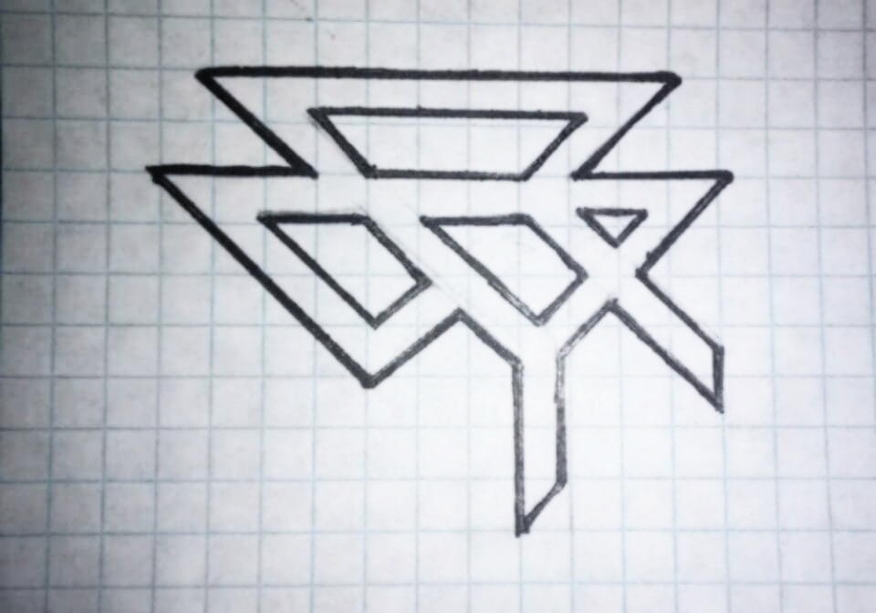
How about a geometric wolf head (less complex than below) with the name Valdyr above/below in a small, subtle font.I'm in the beginning stages of an upstart small knifemaking endeavor. Materials, logistics and labor are all lined up. We've decided to call this "brand" if you will, Valdyr (Old norse for wolf) Designs and I have been tasked with creating a mark. We only intend on doing defensive blades, but with a rustic "Viking" look. All of the designs thusly reflect that.
I'm looking for some critique on my most recent go at it. I know, it's unintelligable, but it spells out "VALDYR" in a few different ways, and has a runic look:
Any thoughts are appreciated.

- Joined
- Jan 15, 2001
- Messages
- 4,122
At the recent Blade West talked to a young knife maker who had some nice knives and runes for his logo. Walk two tables away and ask someone who made this knife and no one would know. I like the Randall stamp, tells you who made the knife and no doubts about it. Check over on the Bernard Levine forum, and there are always questions about "Who Made this Knife?" and it is almost always someone who used a logo that does not include a name you can read. John
- Joined
- Jul 5, 2018
- Messages
- 1,063
Runes are all kinds of cool these days, but few will recognize your rune as the trade symbol of your new endeavor. I think you’d be much better off going with a stylized wolf head like the one shown above. It’s similar in spirit to the Shirogorov bear logo and I think it’ll be more recognizable in the long run. Good luck with whatever you do.
- Joined
- Jul 4, 2014
- Messages
- 6,191
The name is more important than the logo.
Your brain will “read” a name so you have a better chance of remembering the brand.
Pick a style of lettering that is easy to make out but distinctive.
Star Wars, Coke, Star Trek and BMW (BMW has their own font) are just few off the top of my head.
Add a simple stylish wolf above or below the name and be done with it.
Use the logo you have now on the back side of the blade on your first production run.
And please don’t make your knife a walking billboard. CRKT, this means you. You too, Kershaw.
- Joined
- Jun 22, 2016
- Messages
- 1,627
That, is also an excellent point.Charlie Mike is an excellent maker and widely respected. Maybe you should take a look at the effort and importance he has placed on coming up with his logo.
- Joined
- Jun 22, 2016
- Messages
- 1,627
That's nice work. I'll kick you a PM tomorrow. I've had a long, tiring day of hand therapy. Thanks for the interest!OK, just a quick mock-up I did this morning for your personal WA3....
The W and A are still runic inspired shapes, but also give a modern look when combined together. I'm not thrilled with the 3, but again, it's just a quick mock-up. If you want some serious help with conceptualizing a WA3 or Valdyr logo, PM me, and we can talk.

- Joined
- Dec 7, 2016
- Messages
- 11,261
I'm in the beginning stages of an upstart small knifemaking endeavor. Materials, logistics and labor are all lined up. We've decided to call this "brand" if you will, Valdyr (Old norse for wolf) Designs and I have been tasked with creating a mark. We only intend on doing defensive blades, but with a rustic "Viking" look. All of the designs thusly reflect that.
I'm looking for some critique on my most recent go at it. I know, it's unintelligable, but it spells out "VALDYR" in a few different ways, and has a runic look:
Any thoughts are appreciated.
As your friend I would have to say that self defense blades for people who want a viking aesthetic is probably a very niche market.
Also you won’t attract the mall ninja customers.
- Joined
- Jun 22, 2016
- Messages
- 1,627
Yep. It's a good businiess practice to fill a niche. Carbon steel, wood, brass and effective, innovative designs.As your friend I would have to say that self defense blades for people who want a viking aesthetic is probably a very niche market.
Also you won’t attract the mall ninja customers.