- Joined
- Feb 27, 2014
- Messages
- 17,936
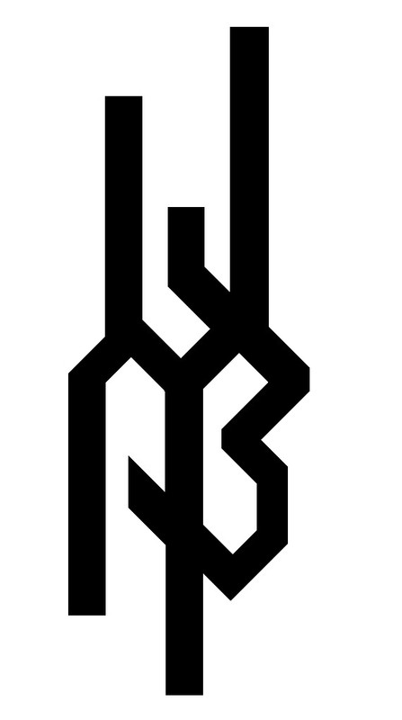
The logo and the knife look way too busy for me.
The BladeForums.com 2024 Traditional Knife is available! Price is $250 ea (shipped within CONUS).
Order here: https://www.bladeforums.com/help/2024-traditional/
A complex logo can look great, but it still needs to be recognizable. By uncle was a system maker out of CA. He used to use just his name. As time went on, he worked on a more complex design. But still included his name with the logo. Think Loveless reposing lady, super recognizable, but you still see the name. The Scagle mark and name, Randal Scimitar and Randal name, etc, etcThis was my main concern. I'm a visual artist firstmostly and tend to get carried away.


An excellent point to consider.Ya want to be able to google it. How would ya google it as is?
")
Thanks for the advice! I was also considering having it laser engraved. I'm always tweaking and redesigning stuff (I make band logos as well) and I'm sure, with adviceIf you have to explain what it says, it's a fail.
You could use a decorative initial letter and spell out the rest of the name in a less decorative font. That'd give it style and still get the name out there.
Or you could use your graphic on one side and spell out the company name on the other.
As for the graphic. I think it is busy and that it won't reduce well. Once small it'll probably plug up and turn into a blob of sorts.
Etches and stamps aren't as sharp as a laser copy or view on a monitor.... especially when reduced to fit a blade.
I've been doing this stuff since the mid 70s and logo design is about as difficult to get right as anything.
I go by
Less is more. More or less.
I'd like to pick your brain a bit, I'll be in touch. Thanks for the insight.As a designer, quite frankly, the logo doesn’t work. I say that, not to be mean or brash, but starkly honest. If I client came to me with it, I’d highly recommend it be redesigned from scratch before moving forward.
From a business and design standpoint, a logo (especially one for a new business) needs to be instantly recognizable, and easily identified to the viewer. Remember, you may be making knives, but you’re building a brand.
Think of the most recognizable logos out there. Even if they are a bit abstract, they are simple and clean - Nike’s swoosh, Apples’s apple, Pepsi’s globe, or Chevy’s bow tie. Even if you didn’t know the names, you’d be able to recognize the mark if you say it, and easily draw or explain it to someone.
The wolf’s head is a good idea (you could even give it a bit of Nordic influence if you wanted). If someone didn’t know your brand, they would at least be able to quickly identify the logo a second time (if done right).
Feel Fritos PM me if you want some help.