2015 Forum Knife. A Work in Progress!

Since we're seeing knife pictures in progress. Here's the label in progress (mostly complete?).

Xf0gi9Al.jpg


The label looks good! I think "serpentine jack" is fine eventhough Jeff is correct that it's not the pattern name. "Serpentine" is a description. It is a type of "Jack" and it is serpentine so I think it works. Levine calls the pattern a "double-end premium jack". A long time ago, they were called "stock knives" but now that term is usually reserved for knives with more than 2 blades.

Nice work, guys! I'm looking forward to seeing more production photos!!
 
Single spring, two blade folders over 3 1/2 inches are too large to be considered 'pen knives' and so are deemed 'double end jack knives'.
 
I could see some emerald green in the logo; it would flow well with the naming convention. Either way, it looks great.
 
I like that label Liam!!
I think it works on the green box also.
 
Thanks for the feedback and thoughts. I've added some green into the banners, and the descriptor "Double Ended" - barring typo edits, I think this is the one. :)

ETA: Update
AHgtWLPl.jpg
 
Last edited:
Nice. You might use "double-end" instead "double ended". If you want it to have the pattern name, "Premium" could replace "Serpentine" on the banner... not sure if would fit well though.

I don't know much about the graphic arts. Are there limitations in the number of colors? Are metallic colors possible or does that require special printing techniques? The metallic gold looked great on the Champlin tubes and boxes. I don't know if something similar would be possible or would even look good but I'm just spouting off ideas.

http://www.jbfchamplin.com/wp-content/uploads/2015/09/rusty-jbf2.jpg
http://i709.photobucket.com/albums/ww99/joker354/Mobile Uploads/1430622015_zpsa3d43885.jpg
 
I'm with Jake, DOUBLE-END instead of DOUBLE ENDED, and maybe drop the text to center between the banners.

The touch of green looks great!
 
I like the hyphenated "Double-end" - I'll update that.

Metallic is not really an option for these without moving to a different (and much more expensive and time consuming) printing press. If we were doing a larger number of labels or charging a premium, we could foil stamp them (which is what Champlin did) - but I don't think we can go that route for these.

Otherwise, there is not really a technical limitation on color - these are being printed in 4 color process (CMYK) colors, which allows us to mix up most anything, but for this purpose, on the green box, I'm trying to keep things from getting too crazy. It's very easy for something to muddy up when you have these smaller label sizes.

Personally, despite Levine's name, I prefer the Serpentine label. More useful as a description of what's actually in the box for most people. Thanks so much, Jake!
 
I really like the improvements that you did on the label. I really think the color scheme is going to go great with the dark green box.
 
Thank you for the explanation of the printing, liamstrain. Makes sense. I like the updated label with the change in text--looks good!
 
I love it when a plan comes together!

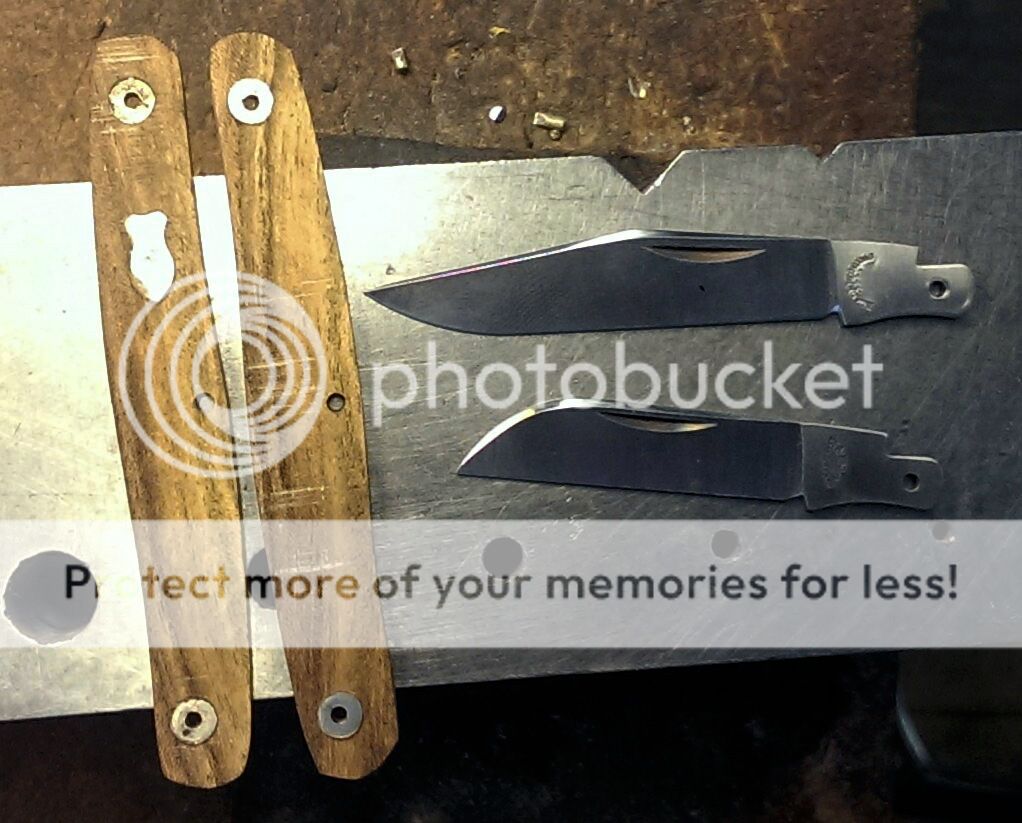
Eric (ea42) supplied this partial parts photo of the first 'mock-up' knife to test the fit.

 
I love it when a plan comes together!

Eric (ea42) supplied this partial parts photo of the first 'mock-up' knife to test the fit.

Oh My! My two favorite blades, and so nicely done. I am loving everything about this years knife! :D :thumbup::thumbup:
So sweet to see this coming together so fast.
 
Great label Liam! Thanks!
Eric, Thanks for the pics. Those swedges look awesome! Barry, thanks for posting these up. Looks like things are coming together nicely!
 
Would there be any chance to get one with more pointy wharncliffe blade?

If you did not know, the blade is not a wharncliffe blade, the knife as designed is clip main and sheepfoot secondary. If you are asking for a Wharncliff blade that boat has sailed.

Russell
 
Back
Top