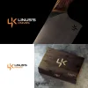
Help me choose my winning logo design! 2nd poll

All wrong. I would watch my inbox for the order confirmation. ;)

But what I am getting at, is I hate a billboard on a knife (i.e. I would refinish the blade to a satin sans billboard). It's why my own maker's mark is minimalist, but also unmistakably mine, even though it only has my first initial.
that's probably what I would do also:)
I want my logo to be very small but recognizable which is why I've narrowed it down to the 4 options I've chosen. For the most part, they are all pretty small (the logos that is, not the text) and would still be recognized (hopefully)
 
There are some pretty established and talented makers on this board. I would be curious to know if any of them have modified their marks since starting out, or if they wish they could or had.
 
There are some pretty established and talented makers on this board. I would be curious to know if any of them have modified their marks since starting out, or if they wish they could or had.
yeah, that's what I'm trying to avoid... I've only made 20 or so knives total and not very many for customers so I'm trying to establish a "brand/logo" before I sell too many.
 
All wrong. I would watch my inbox for the order confirmation. ;)

But what I am getting at, is I hate a billboard on a knife (i.e. I would refinish the blade to a satin sans billboard). It's why my own maker's mark is minimalist, but also unmistakably mine, even though it only has my first initial.
Your opinion on this will carry more weight after your sales exceed LCT's . :rolleyes:

My point is just that crass self-promotion can be a major asset in business .

Getting your "name recognition" is all important .
 
My point is just that crass self-promotion can be a major asset in business .

I prefer class over crass, and if that means I remain an obscure maker who only manages to make a modest living bringing some joy and convenience to fewer than a million guys over my career, so be it.
 
In fact, I'd even suggest paying for the Bladeforums username change. Adding the apostrophe to denote possession in Linus's Knives, or Linus' Knives does seem rather clunky compared to just "Linus Knives" now that you mention it.
 
Linus Knives Linus Knives if you question whether you would be in good company going with a simple graphic only, and no name actually written on the knife:

Uf3iKhp.jpeg
 
In fact, I'd even suggest paying for the Bladeforums username change. Adding the apostrophe to denote possession in Linus's Knives, or Linus' Knives does seem rather clunky compared to just "Linus Knives" now that you mention it.
Yeah, that is my thinking, too. I can't recall off the top of my head, but there have been companies in the past that started with possessive names but over the years simplified since people invariably put the apostrophe in the wrong place, etc. After all, it is not Ford's Motor company but rather Ford Motor company.
 
I get it. Let me see what I can do with my designer when I choose the winner. Im not sure about getting rid of the apostrophe all the way but I might change it to Linus' knives. let me give it some thought
 
Also the guy who made that knife I posted above makes it as convoluted as possible. Knife company name is not his given name, and neither is his forum name. 🤣

And yet you would be hard pressed to find a more respected and reputable custom maker.
 
so far the winning option is this one:
if I choose this one as the winner I will ask about changing the name to Linus knives or Linus' knives
attachment_154961591.webp
 
Also the guy who made that knife I posted above makes it as convoluted as possible. Knife company name is not his given name, and neither is his forum name. 🤣

And yet you would be hard pressed to find a more respected and reputable custom maker.
I personally really like the logos that are a little hard to recognize but professional. Isn't every business like that?
 
If I may, once again, I would invite you to consider reducing the separation between the elements of the K, and adding separation between the L and K
 
logos that are a little hard to recognize [...] Isn't every business like that?

I think that allowing your maker's mark to look like it says something it doesn't (i.e. 4K) is, if not a blunder, at least an inaccuracy, probably a mistake (pardon the chess terms). It may not lose you the game, but it doesn't do you any favors and may make things harder than they need to be.
 
Another -or additional - potential tweak is reduce the height of the K
 
Back
Top