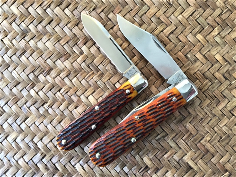
On all the 14 TCs the edges of the “C” are not parallel around the curve, they diverge creating a fat spot at apex. The 15s don’t do this and it has nothing to do w/ how it was struck but rather the design (does that make it a new font, maybe not but that is a semantic argument). If you guys can’t see it, no biggie but it is there and I’m not alone in stating/seeing this difference….go ahead and test the porch, post a bunch of TC Barlow bolsters and I bet many here can tell which are 14s and which are 15s.


 lain
lain