Complications in a watch are greatly desired, but in a logo, not so much. Aim for something that is easily identifiable to the average person, that they can draw from memory.
Interestingly enough (without getting into religious debate), the Cristian cross is one of the best logos of all time, and possibly the most well known. At it's purest form, it is simply two perpendicular lines that intersect. Beyond the teachings of the church, the symbol itself is one of the major factors in the religions spread across the globe. It was easily scratched into stone, carved into wood, sewn into clothing, or painted on items by practitioners, and easily recognized by passers by. A Christian could walk through any city in the western world during the middle ages, simply look to the rooftops and find a church in moments. A pilgrim only had to look at the shield of advancing soldiers in the Middle East to know if they were friend or foe, without having to determine what the various colors and flags carried by an various army represented - if there was a cross displayed somewhere, they were assured of relative safety.
While you're not spreading gospel (as far as I know...LOL), the cross is the gold standard for logo's. Clean, simple, and easily identifiable. Sure it has deep symbolism tied to it, but from a design/marketing standpoint, the symbolism is secondary. It falls right in line with the Nike Swoosh, Apple's Apple, or McDonald's Golden Arches - all of which are easily recognized be even the average 8 year old.
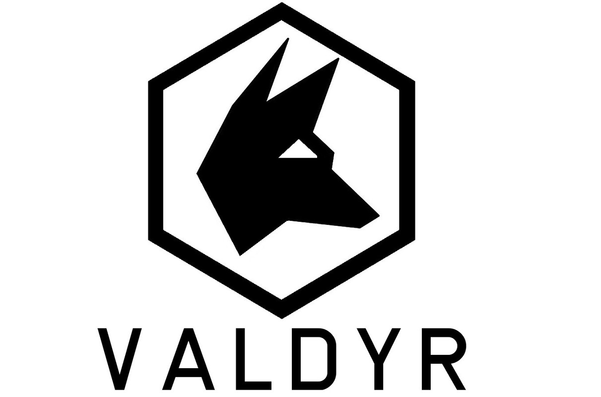
You're obviously not going to have the instant brand recognition that these have. You're playing to a much smaller audience, and haven't even made a name in that field yet. But you can learn from them. A simple stylized element like a wolf's head, the V, or such, incorporated into the name, or placed beside it, can be used to great effect. And you can take that element out, and used it as an individual 'bug' to reinforce recognition.
Good examples of this include:
Amazon, who often uses the 'arrow-smile' by itself
Good Year with the winged shoe
Or Calvin Kline, where sometimes just the C and K are used (but always in the same font)
I know this became a bit of a dissertation (even more than I intended), but I deal with logos in one form or another everyday when I go to work. And I see a ton of really bad ones cross my desk, that stand out like a clown nose on otherwise great design. It kills me and my colleagues here in the design department to drop them on top of something we've worked long and hard to make look good otherwise. So anytime I can help steer someone in the right direction, whether I'm creating the logo or not, I do what I can.
Edited for content